Time to get serious! Last time I told you about my engine upgrade and the new “quads,” now it’s to put them to use.
If you recall, for my initial Cogmind map zoom demo upon adding Quad support to REX, all I did was change one thing in the game: the map font size.
The game doesn’t care about the engine side of things so it simply worked, or at least didn’t crash and we could easily see how it’d appear, despite of course numerous input and secondary display issues in some other windows. By just tweaking a few more variables it would be easy to solve all those problems in order to purely have a consistently larger map view. Things get a lot more complex if we want to support both the regular map font and quads, not to mention the ability to swap them dynamically while the game is running.
But with the engine fundamentals solid and behind us, we’re ready to tackle those challenges.
Normally with UI feature implementation I’ll start by writing out a comprehensive list of everything that needs to be done, and any other elements I can think of which might be affected and therefore need testing and confirmation. While I drew up at least part of such a list like a good dev, this is one of those rarer cases where attempting to write a complete list ahead of time is probably not all that feasible or helpful, as it’s basically… the entire interface :P
With a change like this I would need to test pretty much everything, so instead of trying to be complete about it, I just noted areas of the code to be adjusted as I thought about them while working on fixing high-priority features, trying my best to finish off entire groups of related interface elements to speed up the process.
I started in the most important place, restoring the basic functionality required to speed up the rest of the implementation, like fixing map panning and cursor-map interactions. And realtime zoom toggling in order to easily compare and confirm that everything functions properly in both states.
And it was shortly after getting those bits operational that I discovered I wasn’t quite done with the engine xD
When examining the details of what still needed to be done in the map area itself, I realized that while zoomed in we’d probably also want to increase the font size of many types of text that appear over the map, especially object labels which are already integrated pretty tightly into the map coordinate and orientation systems.
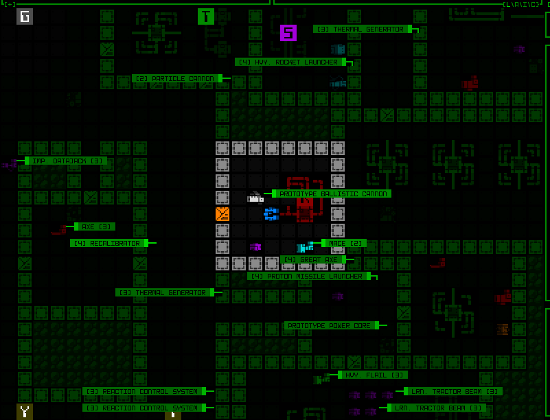
Yeah these labels are not great like this, using the regular text size (ignore the fact that they’re not even pointing at the right objects here :P).
To maintain the proportionality of map-related text when zoomed in, we’d need… zoomed text. Oh no.
Back to REX
Last time I introduced the engine’s base cell size that fits individual text characters, wide glyphs for square map tiles, and the new “quad,” or four map tiles in order to enable a zoomed effect. To zoom text we’d need yet another type of glyph size, one that like the doubling of map tiles for quads (2×1 to 4×2) instead doubles text/base cell size (1×1 to 2×2!).
For me one of the first annoyances was what to call this new type, and I decided they’re probably best named after the number of base cells they occupy, meaning I had to go in and retroactively rename all the quad stuff to oct. Now our zoomed text glyphs can assume the name “quad.”
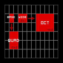
A new member joins the REX glyph type family!
Because I had built a generalized system to simplify handling of both wide glyphs and octs (previously quads), inserting this new type was actually fairly easy (whew!).
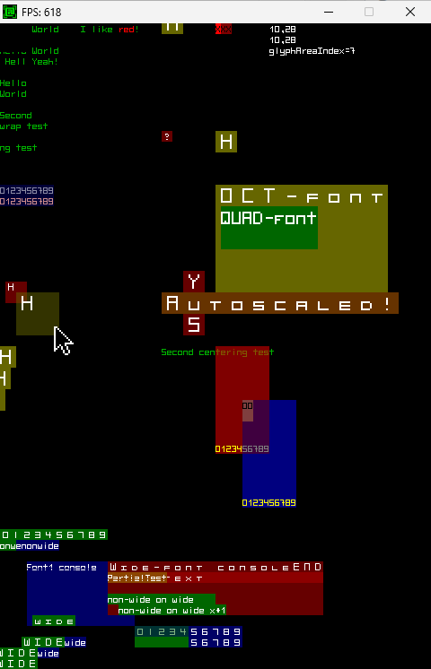
REX again displaying operation of the newly renamed octs, and the new quads (the main new area of interest being the large olive-colored box).
Well, the initial implementation was fast, but on returning to Cogmind to apply it to map labels I found an issue…
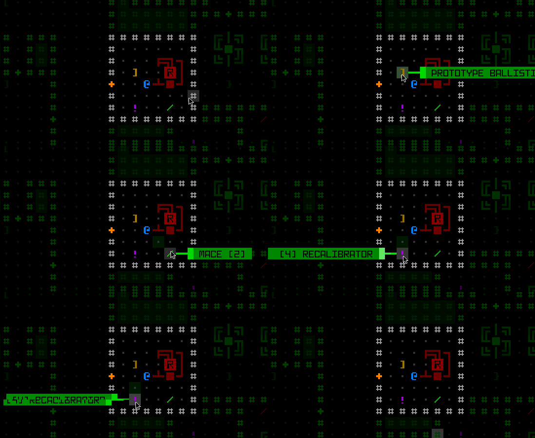
The text quads worked nicely in most places, but sometimes this happened. Perhaps we’ll just say this Recalibrator is corrupted and leave it at that? :P
It took a while to figure this one out, since I couldn’t quite tell if it was a Cogmind problem or a REX problem. This was particularly tricky to track down because it looked like an engine bug but also had a property that suggested it couldn’t be an engine bug, yet its other behavior pointed to it to being impossible to be a bug caused by the game itself… Anyway, a really weird confluence of situations managed to hide the real reason for a good hour. It had to do with a specific type of partial transparency of the new quads/octs, and of course it was caused by just one line of code in the engine.
Zoom Text Applications
Yay now we can have some large text on the map, too!
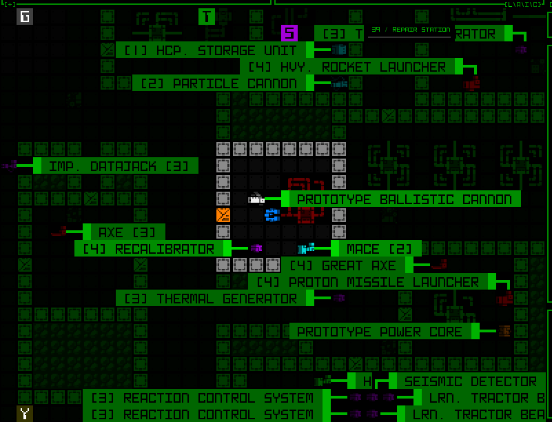
Revisiting the scene from earlier, this time with larger labels.
Beyond labels, I also enabled the on-map mode indicators to make use of quad text. To facilitate this (and by necessity for architectural reasons), I also refactored that part of the UI--they used to be drawn directly to the map at the end of its rendering process, but now they are a real window.
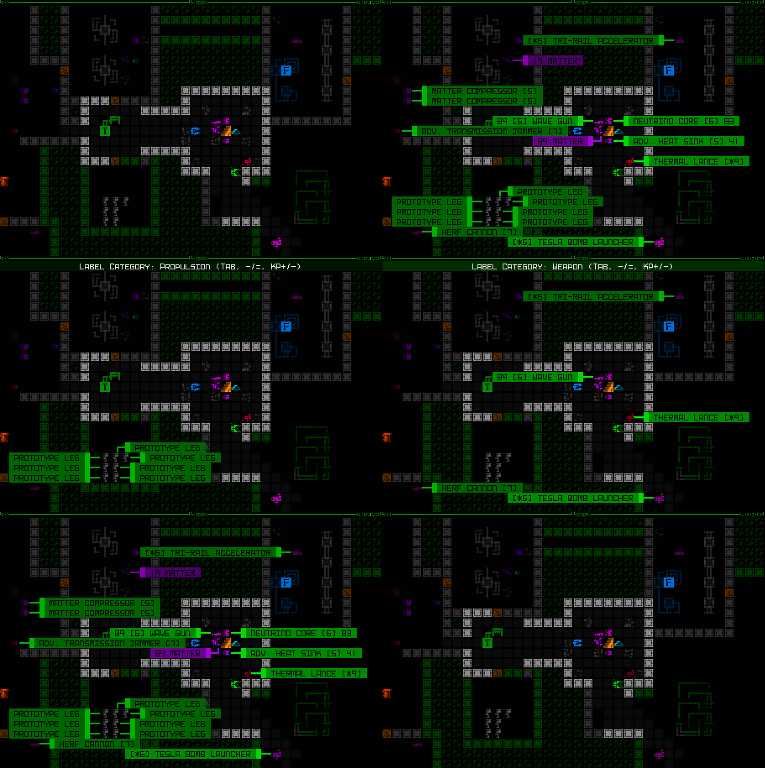
Cycling through item label categories, with the mode indicator visible at the top of the map view.
On-map popup alerts like low matter/core/etc. also got the zoomed text treatment, for one because they otherwise looks fairly small compared to everything else and would be even more likely to go unnoticed.
“ALERT” announcements are also larger now, almost too large when they include longer strings, but again having them remain at normal text size doesn’t seem ideal for getting noticed among the larger map cells. I might tweak those later when the UI undergoes more changes down the line, but for now they’re large.
I also decided to convert the program shutdown animation to the zoomed text, and unlike its other uses described above, this is the only instance in which it is used regardless of map zoom state.
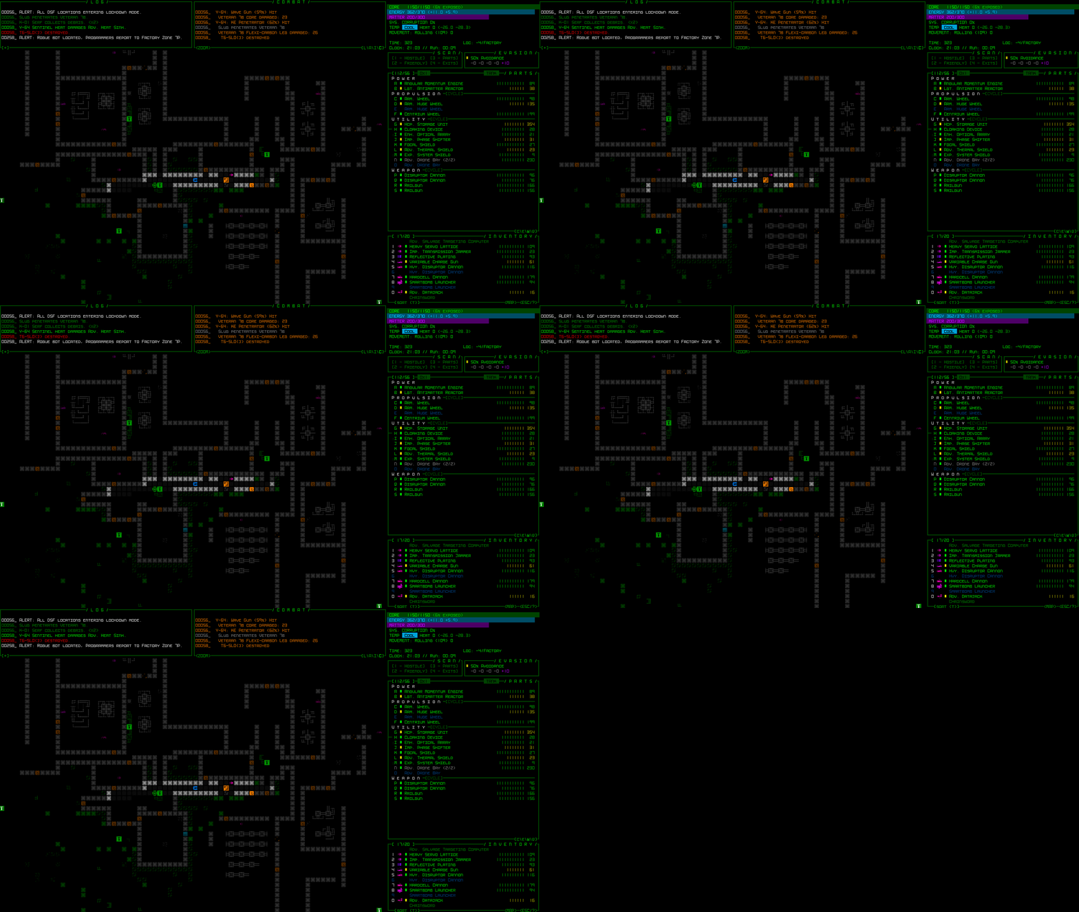
Cogmind’s program shutdown animation with larger central bar.
The MegaTODO
The UI is way more than just a handful of temporary popups though! Back to that growing list of challenges… well, technically most are not especially challenging, it was just a case of putting in all the necessary hours to scour the source for anything affected by the advent of new glyph types.
There were lots and lots (and lots) of alignment issues due to years of relative coordinate assumptions behind the fact that map spaces were always twice as wide as text, and both text and map spaces had the same height. Now map cells could be four times as wide as text, and twice as tall!
Most popup windows relative to something on the map needed to have their dynamic coordinates take into account additional calculations.
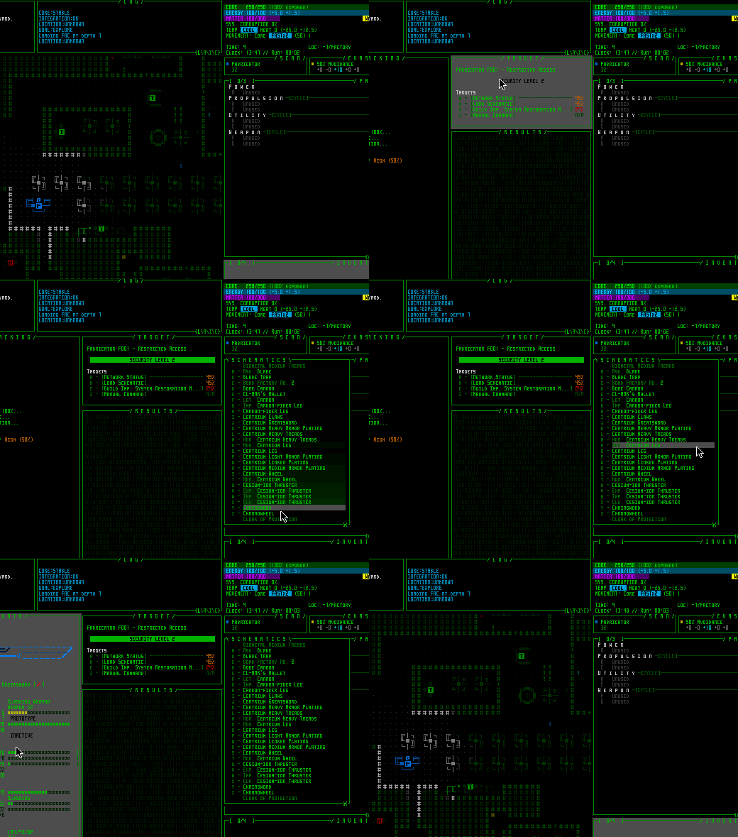
The old REX debugging visualization for examining UI z-depth and cursor hover focus came in quite handy for solving some of the more mysterious issues.
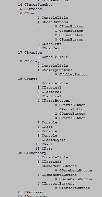
I also finally built an exporter for Cogmind’s window index structure to help track down some issues related to cursor input. In fact it also helped me find and resolve an unreported and difficult-to-notice bug in Cogmind’s UI that’s been in there since the very first version!
A chunk of the adaptation work actually required larger architectural rewrites, like the project of splitting the map interface into a trio of classes.
The first new class was purely to hold interface data that must be preserved during zoom events. Whenever a zoom occurs, the entire map interface is actually destroyed and recreated from scratch (far simpler than trying to convert everything over), but doing so would also lose some important info needed to facilitate various QoL features such as targeting history and resource alarm records. So data of that nature was moved to an external class to preserve it regardless of any zooming.
The second class is more interesting, a kind of container for other windows, those that are positioned over the map itself.
A number of windows such as on-map dialogue lines, combat logs, and achievement popups may need to be placed on any UI row within the map area, and these being organized under that window itself was never an issue before. But what happens when the map is zoomed such that a single “oct” occupies two rows? The map window’s grid coordinate system now no longer has any values corresponding to every odd row of the main interface, meaning its child windows cannot be placed on those rows.
So all of those map-related windows in which vertical alignment is important down the sub-row level needed a new parent window, kind of a fake alternate map window that always has a finer coordinate system regardless of the viewable map’s zoom state.
None of these informational windows are interactive, either, so this “finer map” window doesn’t need to capture mouse input and only has to occupy a 1×1 spot in the top-left corner of the map. It is a good example of an “unhidden yet transparent and therefore invisible” control window, allowing it to update normally and its children can both appear visible and use their parent as a coordinate reference (placing subwindows outside of a parent is fine).
The reason it must have an unhidden state is because that’s a prerequisite for actually updating itself and updating children, but is at the same time transparent because the window doesn’t actually want to display anything of its own.
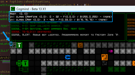
Another useful debugging feature, the ability to show all windows that exist under a given cursor location and their z-depth. With the cursor in the top-left corner of the map there, it shows that there are two map classes overlapping at that location, the single-cell window container CMapFine, and the regular CMap class. The other values can show things like coordinates, indices, current colors, tile values, and any active animations at that point.
So yeah, long story short, this process wasn’t just about changing font settings and recalculating coordinates.
At this point all the heaviest lifting was done, but there was still an awful lot of residual work before map zooming could be called feature complete. I’ll share more on that next time.
This is the third in a five-part adventure through the process of putting all this together:
- Realtime Image Scaling
- Engine-level Architecture
- Implementation
- Polishing
- QoL

