The core functionality of our map zooming feature is operating smoothly--common windows are popping up where they’re supposed to go, map interaction itself appears normal… however there are plenty of less vital systems that still need to consider the effect of zooming.
And after those there’s the public-facing side of this feature, like how do you access it, and do we need to animate it?
Odds and Ends
Gotta check every little thing, like the tiles-ASCII toggling animation, does that work?
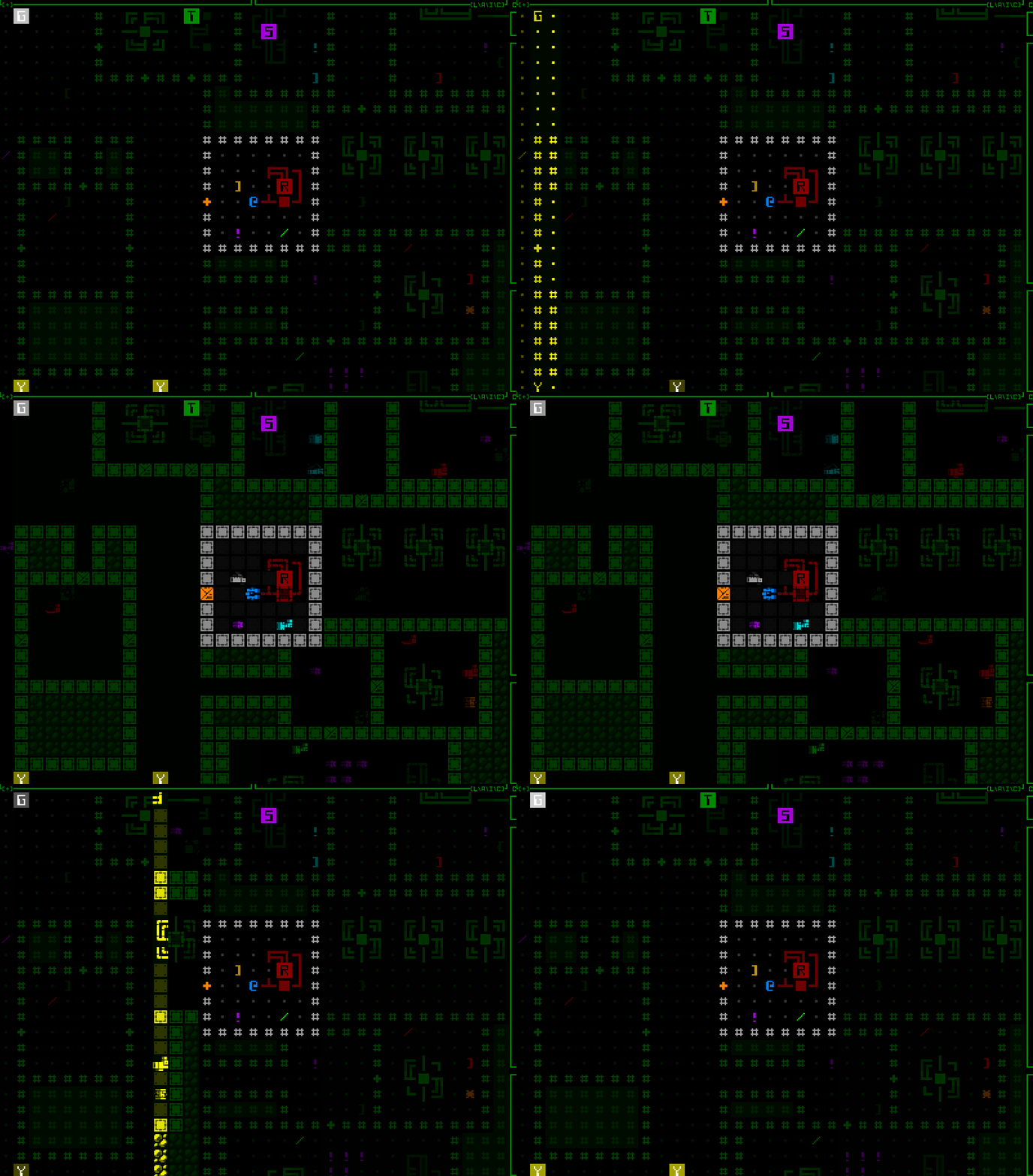
Nope.
How about the map export function?
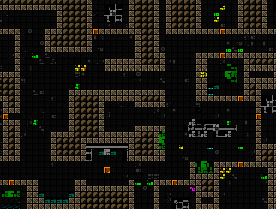
Nope.
Anyway yeah just a case of going in and seeking out what prior assumptions they made about the interface that no longer held true when zooming is possible.
For the tileset animation I think it was as simple as having needed to set it to match whatever tile size the map is currently using, rather than always using the standard size. Funny result though :)
The map export issue was similar, resulting in only the top-left corner of each oct tile being rendered, but to a huge mostly empty image. Resolving that was a little more complicated than simply switching to a dynamic tile size because you don’t want the output to actually use larger tiles (doing so takes forever and results in a massive image file that doesn’t even add any extra data since it’s purely a pixelwise upscale). Instead what happens now, assuming the player is zoomed in, is an automatic zoom out, prepare the image, then zoom back in, all behind the scenes. (Map export images are created by repeatedly moving the map view, rendering the view area, and copying that view to an image surface, eventually stitching together all the views into a final image.)
Many of Cogmind’s optional special modes also have their own UI elements, usually an interactive window in the bottom-left corner of the map, and although I don’t generally update those, failing to have them take into account a zoomed map would almost be equivalent to leaving them behind. That would be bad, especially the fan-favorite Player 2, and the essential-for-some RPGLIKE.
This ended up requiring that some of them be moved to the new window-container-map-view-thing I described last time, or in other cases slight architectural changes.
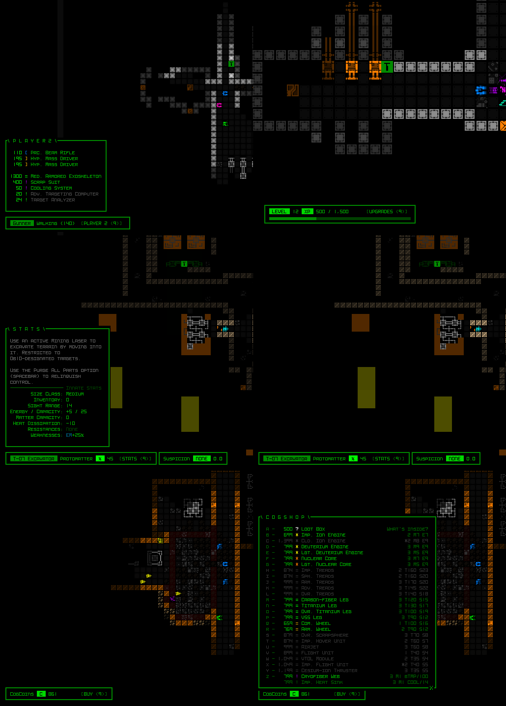
Sample special mode consoles remaining functional regardless of zoom state.
Okay we’re just about finished up with the zoom function here, let’s not forget about the last but not least important test of all… stress testing!
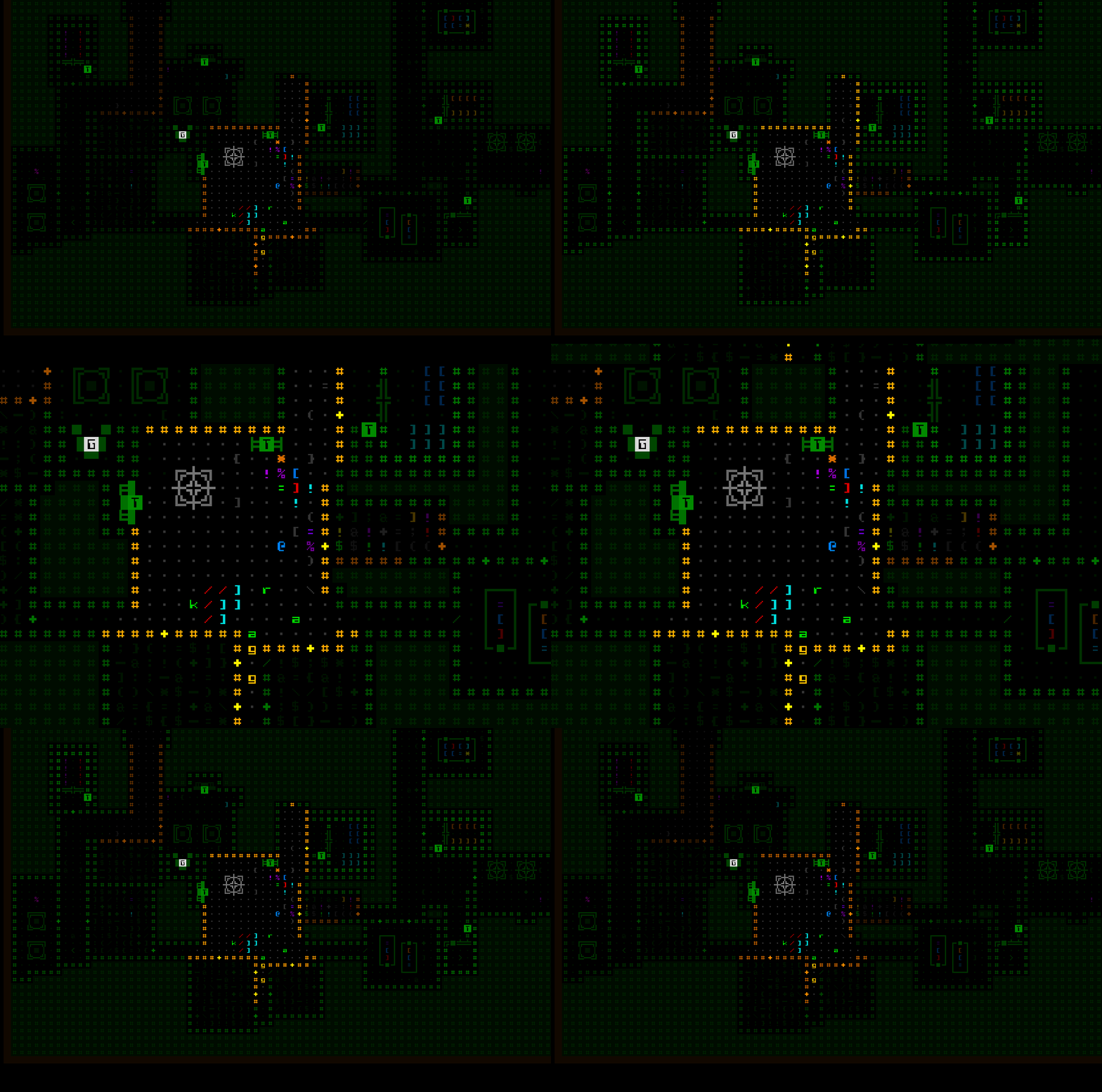
Repeatedly zooming in and out doesn’t seem to break anything, except maybe a few eyes if you keep this up.
Access!
From the beginning and throughout this entire process so far, I had simply dropped the zoom toggling code into the input section for responding to the map intel key, ‘z’. Now it’s time to consider how the player will access this feature…
Actually, as far as keyboard input goes ‘z’ seems appropriate, yeah? Obviously.
Then where does intel go? Under past circumstances I’d be tempted to leave map intel to F8, its matching window key which also works, and despite the awkwardness of F8 being a function key, I don’t believe toggling intel has been a common need in the first place.
That said, while working on map zooming I’ve also been somewhat thinking about interface developments down the line, and realized we’ll later on need to free up yet another key anyway, so where can we get two keys? The answer is inventory sorting.
Cogmind’s inventory can be sorted by type, mass, and integrity, each with their own key (t/m/i). We don’t really need the latter two. It’s not that they absolutely never come in handy, but after the Beta 11 storage rework the largest build inventories are no longer as extreme as they used to be, so there are fewer items to parse through, and you can also relatively easily see the mass/integrity info fairly easily in different data visualization modes--colored bars and numbers for integrity (which are also automatically subsorted for matching parts), and the ‘q’ info mode shows mass as its first number.
Two whole keys! And lucky for us they match our needs perfectly: ‘z’ for zoom, ‘m’ for map intel, and ‘i’ for… well you’ll found out what that’s for later ;)
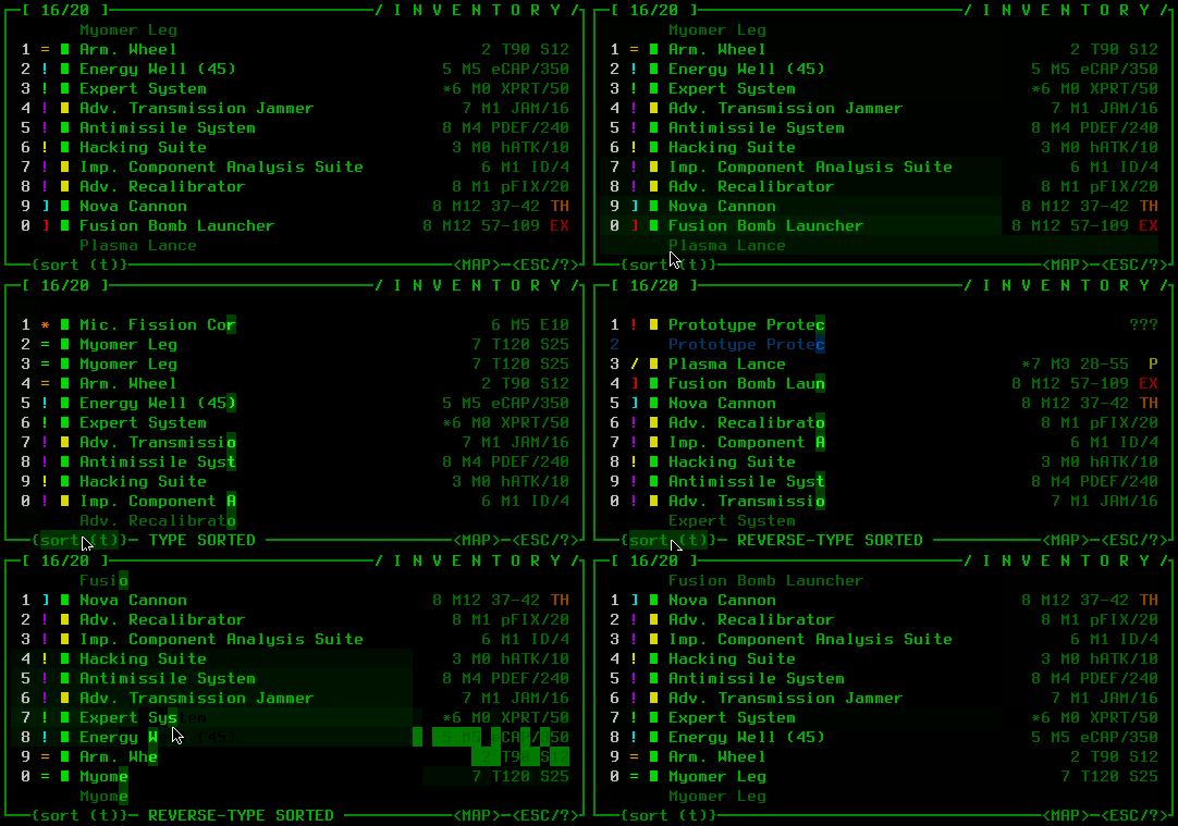
The inventory’s {t/m/i} buttons have been replaced by a single large {sort (t)} button.
So anyone wanting to toggle the zoom state of the map can tap ‘z’ and boom, but what about mouse users? Can’t forget mouse users.
I had some different creative ideas* for this one, but settled on just making it a typical button. The <ZOOM> button appears directly over the center of the map, in the bottom left corner of the central multiconsole. It uses the same style as the <MAP> and <ESC/?> buttons, and is similarly capable of glowing.
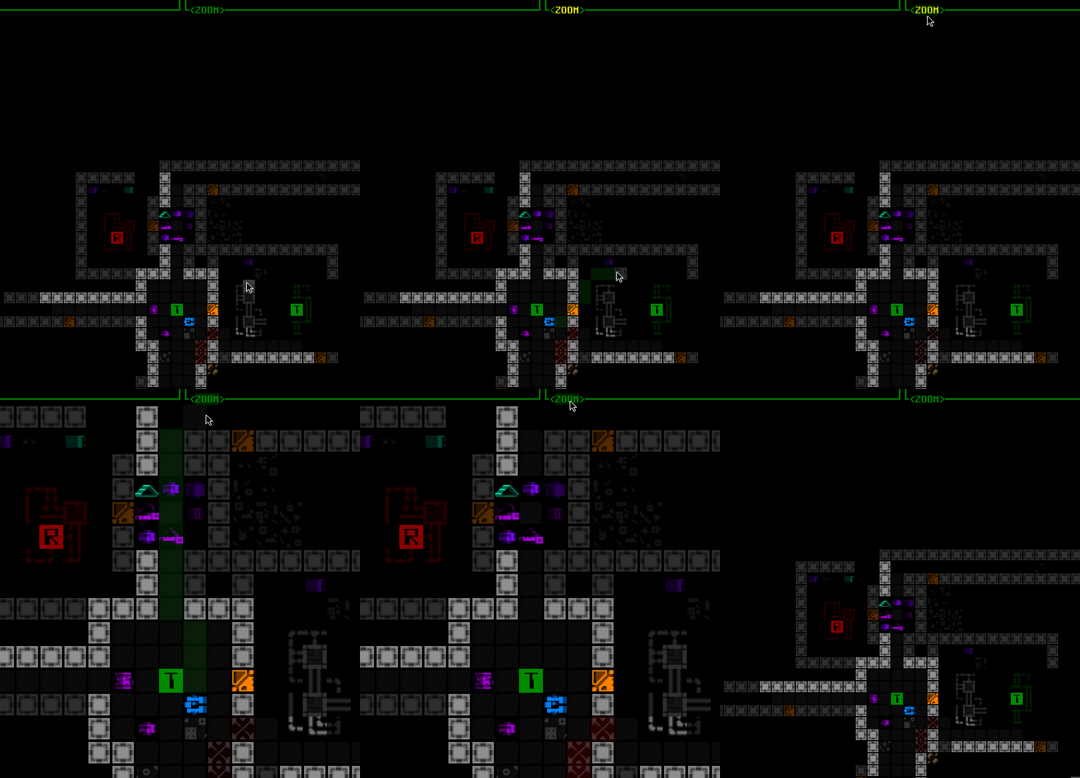
There is also a new tutorial message shortly after starting the game that points out the zooming feature, after which the button will glow until it’s used for the first time.
The button disappears completely while keyboard mode is active (like the CYCLE buttons in the parts list), since it’s not needed in that case.
*Before getting creative I originally wanted to use the mouse wheel for zooming, but it’s a mere toggle rather than a smooth zoom, so that’d be a bit of a waste for the wheel, and making such a change would remove the simple method mouse users can use to pass turn(s).
Fluff
Towards the end of the map zooming work I couldn’t help but take advantage of the opportunity for a new animation to test out a lot of possible concepts. Like dozens and dozens of them.
I shared a bunch of samples from that process on Patreon, like this one I thought was pretty neat:

In this animation test, zooming the map in ASCII mode merges multiple copies of each character into a larger version to fill the final cell size.
The problem with such animations is that they can be too distracting when the purpose of adjusting your zoom is clearly to get a better look at something or some things, be it closer up or further away. So you need to be able to quickly focus, a need which most animations are likely to detract from.
And while sure it’s fun to get a cool new animation, if it gets in the way it would more easily “get old.”* Yeah we could make it optional, but if it’s detrimental and most people would presumably want it off, then why add it in the first place?
*on that note, I do plan to eventually swap out the world map animation for something snappier! the world outgrew that thing a long time ago…
In light of that analysis, and having not found anything extremely compelling while exploring animation styles, from early on I was already leaning towards having no animation at all--short and sweet, right? Instantaneous results, either big like you want it or small like you want it.
But maybe there’s some other type of animation that could add a little style and maybe even be somewhat helpful for quickly digesting the new view area…
I got to thinking that one of the main elements that’s universally important and the first aspect you might visually analyze is the general layout of the map. This is usually defined by walls and doors, so what if we just highlighted all of those after a zoom?
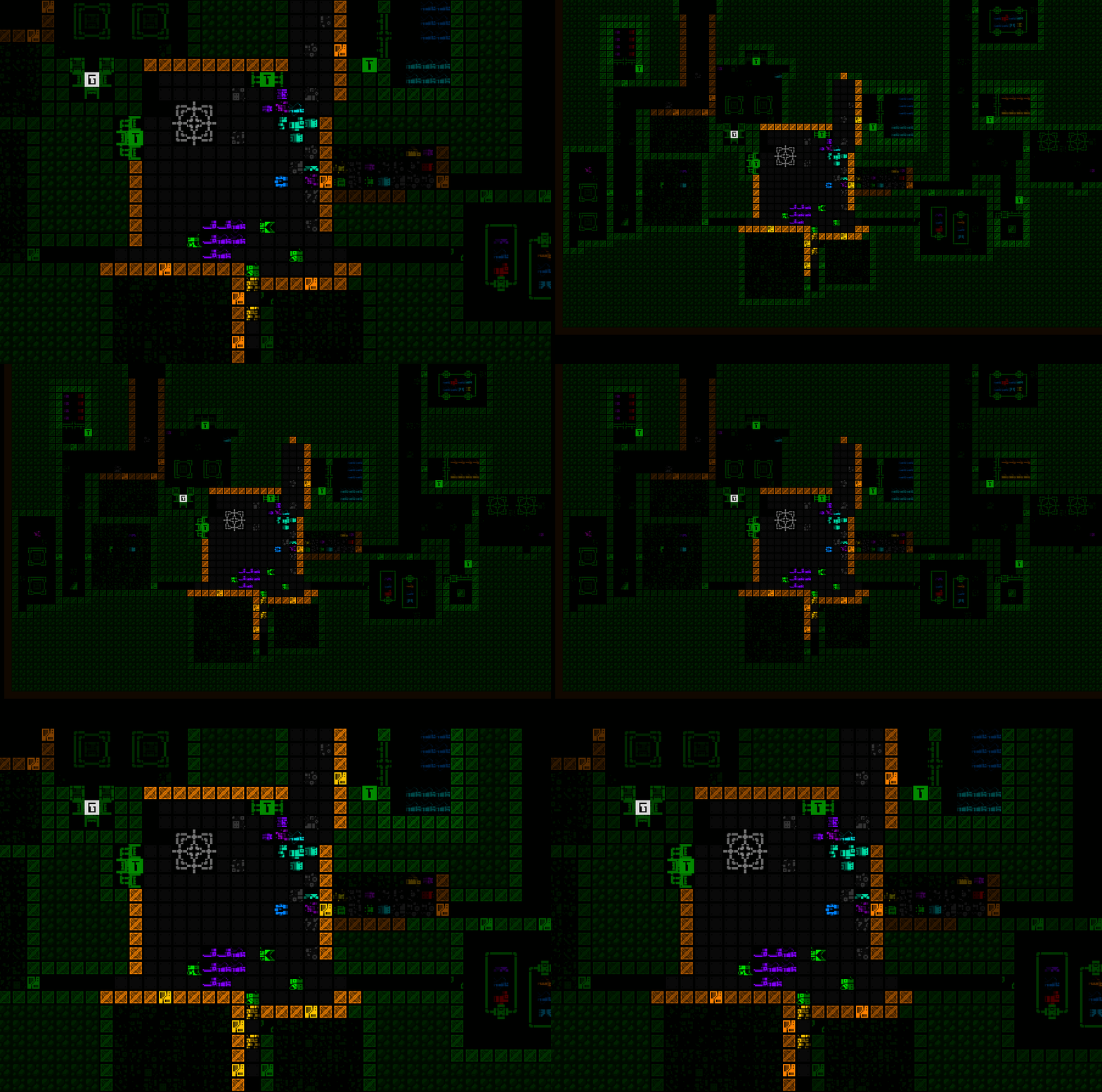
Wall highlighting shortly after a zoom state change. Zooming out lets the highlight last longer since it’s more relevant in that case, having added new content to your viewport.
I also considered highlighting other objects like machines and hostiles and/or something more, but figure it’s easy to go overboard and get back into distraction territory, so decided to stop there for now.
And that’s it, the map is now zoomable, and zoomable in style, and can be played that way. But it’s not yet ideal! Playing with a zoomed map introduces yet more challenges that we’re going to need some new QoL to help resolve next time…
This is the fourth in a five-part adventure through the process of putting all this together:

