Taking a different tack from last time, I decided that it would be worth getting really dirty with low-level engine work for the next attempt at map zooming. One of the main reasons we’d need to go this route if there’s ever to be hope of reasonable performance in software mode: Dirty rects. If we play by the engine rules we get to keep that functionality in its existing simple package, which generally means massive savings on CPU cycles.
REX
It had been a while since I’d done any serious tinkering in “Rogue Engine X” (REX), Cogmind’s underlying game engine. The acronym you might recognize from REXPaint, the engine’s ASCII painting software I built with it for my own use and later released (dang that’s been out for over 10 years now, too, with many of its own users).
I do very occasionally add a little REX functionality here and there to cater to Cogmind needs (or REXPaint for that matter), but it’s been mature for like 12 years so there’s never been any huge developments in that time.
My plans this time were for a pretty big one: Add a third type of glyph size.
To summarize, in traditional terminal style the display is just a uniform grid of monospace glyphs, each with a foreground and background color. Less traditional, and needed to produce Cogmind’s map with square spaces as opposed to rectangular ones more appropriate for text elements, two adjacent text cells can be occupied by a single “wide” glyph.
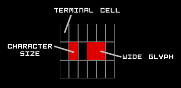
The concept is simple, though does require that text characters take up about half the width that tiles do, which can be a little restrictive at certain sizes.
So the terminal has a base cell size, though doubling the width of that base size gives another wider type of glyph that can be used as well. (I also shared a larger diagram and some related ideas under the section “mixed fonts” in my Fonts in Roguelikes article.)
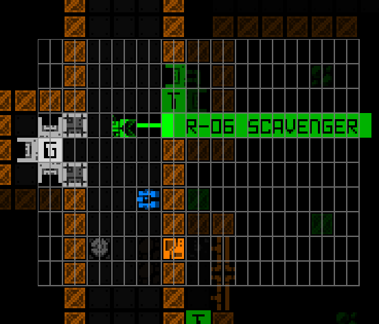
Notice how the tiles in this Cogmind screenshot each occupy two cells, delineated by the partial grid overlay.
In practice it gets a little more complicated than one might imagine from the above description, because glyphs are not drawn directly and immediately to the visible console as shown, but instead first drawn to their own subconsole, and numerous subconsoles can overlap one another at different positions. This is great for organizing an interface, though when it comes time to merge everything to create the final view, partial overlapping means you can have pieces of larger glyphs showing through, etc.
The idea is to now add something even bigger than wide glyphs, but a key point is that whatever the new dimensions are they must still be a multiple of the base cell size. We have the regular base cell size used for text characters, a wide glyph size used for map tiles/characters, and what can we extrapolate comes next for a zoomed map if we want it to retain a square aspect ratio? Enter: the quad.
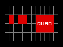
Big chonker tile has arrived.
Doubling the map tile size turns 1 wide tile into 4 (2×2), so while a wide cell occupies two base cells, a “quad” glyph would occupy 8 base cells, 4 in the first row and 4 in a second row. This behavior is similar to the wide glyph, just wider, while also expanding in a second dimension as well, so introducing it to the engine logic is, uh, fun :P
I had to rewrite most of the wide glyph support in order to add quads, but having wide support already there to reference was helpful, and merging everything under the same umbrella kept the overall complexity from expanding much.
To design and test quads I loaded up my old REX testing environment, which contains a random assortment of little test consoles and behavior samples to ensure everything is working properly. One of the important things to test beyond basic functionality (which itself took a little while to get down) is quad overlap with other consoles of different types, and screen edge overlaps.
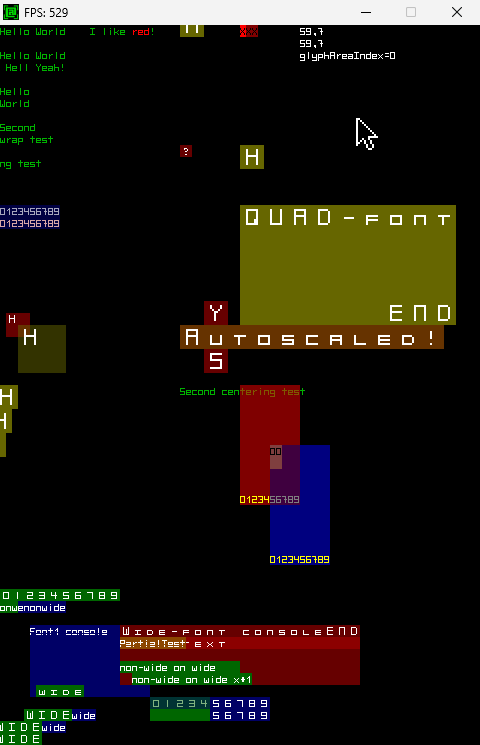
Been many years since I used this thing! It was put together as the engine features were coming together back in 2011 (my first post about it).
Some of the environment is animated/dynamic, though with quads it’s more about rendering and alignment issues, and confirming that underlying data values are correct.
I got pretty excited seeing the quads appearing normally each time a new test was devised and (finally) passed.
It’s official: REX has quad support!
Fonts
REX/Cogmind/REXPaint/etc use bitmap fonts, so if we’re adding a new glyph size that means we also need to accommodate that size in the font files.
While I allow quad fonts to be loaded from file, and that’s what I worked with for the initial implementation, it seemed unnecessary for our needs as far as providing this zooming feature in Cogmind, since our main goal is to simply allow the upscaling of map tiles. Therefore another part of this engine rework was to allow quad bitmaps to be generated as needed. Basically quads don’t have to exist until a given font set is actually set to be used, at which time the bitmap will be generated in memory by upscaling a specified source bitmap which has already been loaded.
Cogmind
Then there’s Cogmind over here not having any idea what’s about to hit it. Hm, what will the impact be? My first quick test was to simply switch the map font to a quad and just… see what happens!
Well for the most part it Just Works. Wow. No crashes, just big tiles.
There’s some obvious kinks like the fact that I didn’t even change the map view dimensions, causing the map view to also quadruple in pixel size and extend off behind the HUD and off screen, therefore “centering” Cogmind in the bottom right corner. That’s to be expected, along with other issues like console alignment and any other source code references assuming the map view is using wide-type glyphs.
But the important thing is that IT WORKS.
Cogmind’s very first use of the new “quad” glyph support added to REX.
That ain’t no mockup. Also because it’s playing by the engine rules there is zero performance hit from this feature. Zero.
You can see the UI jank--to record that I had to turn off autocentering and use the mouse for directional input, plus the misalignments and weird stuff in various locations (check out the items in the inventory xD). BUT IT WORKS.
There is clearly still a lot to do. Manually test swapping the font is literally all I’ve done so far on the Cogmind side of things--the size can’t yet be toggled dynamically, but before starting this whole adventure I did prove it could work in theory by testing whether the game would explode if I tried to destroy the entire main map interface and recreate it on the fly.
The disparity between the surrounding UI text size and map tile size when zoomed is kind of annoying--it’s not quite the same aesthetic, but if it means some people who otherwise might not be able to play could now do so, I guess that’s a good thing! Also again I find myself wondering what portion of potential players will find this sufficient since it doesn’t address text, but maybe in combination with the Terminus font it will work for most people. We’ll just have to find out.
While doing the latest map zoom experiments I also came up with an initial list of complementary feature ideas, those that could help blunt the negative impacts of having a much shorter view range than usual.
- Cogmind may not necessarily be centered when zoomed, instead having the view gradually shift so that you can see further and further in your general direction of travel, out to your actual sight range. Cogmind’s unmodified sight range (16) while truly centered in a zoomed view would extend at most about 4 spaces out of view in the worst case scenario--a north/south direction, so Cogmind would generally be within that distance of the center unless sight range is further boosted. (East-West direction is less of an issue since the view is a horizontal rectangle for most people’s screens.) I can see this dynamic view positioning being fairly complicated to implement well, but a good formula and related behaviors there could save the player a lot of time that would otherwise be spent scrolling around.
- The above feature is likely more appropriate for keyboard users, not mouse users who wouldn’t generally be happy with a map sometimes shifting to a different position under their cursor during successive movements. For that type of input it would be nice to have a way to quickly set your own relative centering position, depending on the direction from Cogmind you wish to see more of while moving or performing other actions.
- Labels for important things, especially hostiles, that enter FOV but are not currently in view can be shown at the edge of the view in their direction. Or perhaps not the whole label, but more like the floating indicators that appear to denote an offscreen drone or Cogmind location. Cogmind already stops and labels new hostiles, so this would just be an extension of that feature to accommodate zoomed folks who want to have a little more info about the cause. Heck, maybe in temporarily pausing the action it could even shift the view over a bit to directly see the cause?
- For new players, zooming the map could perhaps assume they would like everything to be larger or more readable, in which case maybe it’d be a good idea to also automatically switch the font to Terminus at the same time? Just a thought though, not a fan of this approach, and I think it won’t be nearly as relevant given the nature of future planned UI updates…
- This one’s just fluff, but I can see feedback SFX and an optional very fast animation for the transition between zoom and standard view, for people who want to use both and do it in style :)
Lots of optional features out there, it appears, though exactly how many of them are actually useful, and more importantly can actually be implemented in a way that brings out that usefulness, remains to be seen.
Anyway, those are just some general notes for now, and I haven’t done any real playing with this feature active, but later once it’s actually built and not hacked together I’ll definitely be trying out some runs to see what about this setup irks me and if there’s anything I can do about it.
Although a zoomed map this isn’t the kind of feature I want to use, I imagine it could be useful to others, and look forward to seeing where development takes it. I’ve always loved working on UI to begin with :)
This is the second in a five-part adventure through the process of putting all this together:
- Realtime Image Scaling
- Engine-level Architecture
- Implementation
- Polishing
- QoL


2 Comments
I know I’m late to the party but have you ever considered to use signed distance fields for rendering?
Would probably require a complete overhaul, but on the plus side you can use every TrueType font there is (with automatic preprocessing) on the fly and you aren’t fixed to any rendering scale.
Some references:
https://steamcdn-a.akamaihd.net/apps/valve/2007/SIGGRAPH2007_AlphaTestedMagnification.pdf
https://github.com/Chlumsky/msdfgen <- actual tool to play around with, including example shaders
Um, yeah, complete overhaul so not something that would ever happen for that reason alone (unnecessary now), although just as importantly also because it results in a very different aesthetic. TrueType fonts don’t hold the same appeal as custom bitmap fonts.
Final player metrics for Beta 13 are in, and zooming is actually only something that a small minority of players even use at all; as predicted it became mostly moot once new UI layouts were added at the same time. It was mostly an interesting technical experiment. Between the combination of available font sizes and dynamic UI capabilities, everything’s covered rather nicely now.
(Sorry for the extremely late reply, my server is failing to notify me when there are new comments, so I can’t get to them in a timely manner like I used to…)