Last time I described the entire design and creation process behind Cogmind’s latest new map, though a single map can’t quite cover all aspects of the so-called “standardized approach” I’ve taken to level design in Cogmind. So we’re back again today to expand that article with a look at some more potential parts of the process.
Most aspects of map design follow the same routine regardless of whether using a static or procedural base--compiling notes, writing a design doc, thinking high-level gameplay, integrating it with the world, creating and adding content and so on, all detailed in the previous post. But there are a few steps that I apply to level design specific to procedural maps, particularly when establishing their initial layout.
The Exiles being a static map, I could draw out everything in exactly the layout needed to create the desired flow for that experience, but most Cogmind maps are either partially or entirely procedural, requiring that we use other approaches to constrain their generation and exert some amount of broader control over the experience.
The largest main maps in Cogmind are giant 200×200 squares with great freedom in terms of mobility and player options. How do we guarantee a relatively balanced experience in a place like this?
Since advancing to a new map in Cogmind is generally the safest course of action (because it escapes any pursuers, lowers the current alert/danger level, and can both heal you and improve your capabilities), the absolute most important factor for balance is the placement of entrances and exits.
Knowing where these are, and being able to reach them, is of the utmost importance to the player as well, so aside from a possible randomly placed exit that the player may get lucky to quickly happen across, the main exit positions are intentionally placed far away, and built into the very foundation of the map’s layout to ensure they’re probably not all that easy to access.
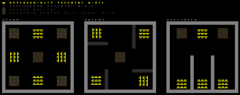
So the first step to a procedural map, before even setting the parameters or running mapgen tests, is actually to fire up REXPaint (surprise :P) and do some orientation mockups. To take some of Cogmind’s earliest floors (“Materials”) as an example, here is a set of possible orientations as planned in REXPaint:
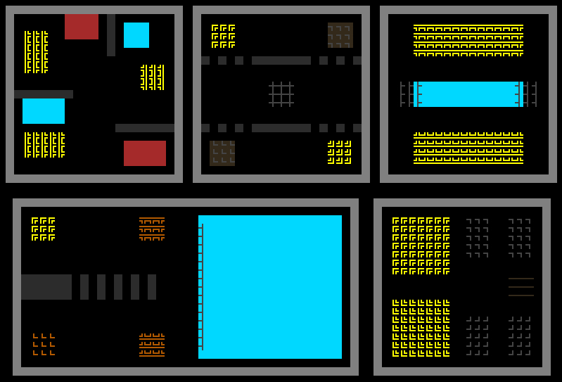
Like the above Factory map sample, this one is built with tunnelers, so placing the initial tunnelers to seed the map also forms its backbone for exploration purposes, basically working “backwards” from all the points of interest until they all collide at various other points. Based on their relative distance and the way they travel, they’re not likely to directly connect with one another for a while, producing circuitous routes.
The generator may also decide to randomly instate one or more optional barriers (thick gray lines) to prevent tunnelers and rooms from crossing over that area, increasing the circuitous nature of the local area relative to other exits. (Please excuse the terrible coloring--the image was taken directly from my messy dev files rather than produced/modified specifically for the blog :P)
Light gray thick lines, on the other hand, are designed to always prevent the map from creating paths in that direction, enforcing a more specific shape for the map and its general routes.
As per the legend there (again, not ideal, usually just for me), more specifically yellow shows where each guaranteed entrance/exit is placed, randomly shifted around in the approximate area indicated, with a tunneler digging out in a random direction from among those represented by the lines. Gray lines on brown are more directional tunnelers that can pick a random direction from among the options, but are used just to fill space rather than act as access points. And brown empty blocks indicate space for random placement of prefabs that lead to branches.
A map can choose from any one of the patterns available, each of which is fairly different so the player doesn’t know which pattern they’re currently playing in (or even that there’s a pattern at all!) and can’t reliably deduce a way out without more info. That said, players do learn and know that edges of the map are more likely to contain main exits (if far away), so trying to follow the edges is usually a good idea, and there are also other forms of “map sense” which players develop over time to recognize various signs that might indicate an exit is nearby.
Different maps in Cogmind have different types of plans and layouts, but in the end the methods and goals are more or less the same.
In the end these layouts are all represented by numbers in Cogmind’s mapgen scripts, but it’s nice to have images for reference during development. (While it would be possible to create a visual method for scripting, that’d be more work than it’s worth in my case.)
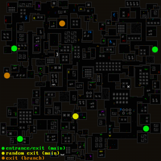
Exits to branches are placed more randomly, thus it’s naturally more likely that exits found closer to where a player enters the floor will take them sideways in the world (to more adventure yet without replenished health) rather than upwards (towards the surface and a win).
In the example above, there are four (green) points where the player may enter from or can exit to another main map. One (yellow) point where they can leave from ended up being randomly placed around the lower middle area, and two branch exits happen to be up in the northwest quadrant.
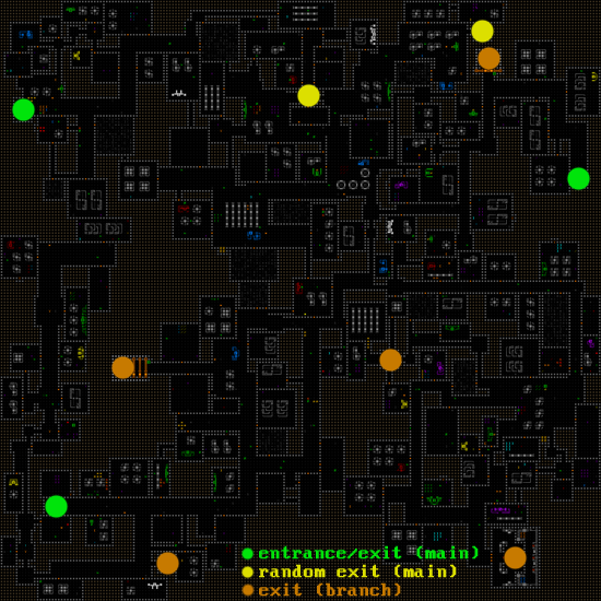
Here’s another example with more connections:
The second version, found at a different depth, has only three pre-placed main access points and two randomly placed ones. It also connects to more branch maps, so here a player is quite likely to reach a branch before finding a way up, giving the option to leave early (by necessity or to seek out branch rewards) or continue further on for a way towards the surface. (Three of the branch exits on this map are also billboarded by their surroundings, making them even more noticeable from a distance.)
Back to the process, though, with general layout guide in hand it’s time to start generating a base map. This is done outside the game in a separate program I put together called specifically for testing and analyzing layout generation without any actual game content. After setting some initial parameters like tunneler locations and behavior, it’s time to watch them in action to see what they can do.
I’ll watch these for maybe 30 minutes--less for really simple maps, longer for complicated ones, seeing if there are any strange outlier results that don’t fit the goal, tweak the parameters, and then continue watching.
Having a separate program is nice since it’s quick and easy, and examining the map at a higher level without thinking about content details makes it easier to focus on macro considerations like how easy it is to cross a given map if one simply approaches it as a maze rather than an inhabited world. The micro can come later.
Still, one thing to remember when working with procedural maps is that what you see in an overview shot during development has very little connection to how it’s experienced in game! It might look like a terrible map but actually be fun while inside it, or it might look like a great map but not be all that interesting, or even tedious or boring to explore. Naturally it’ll be up to the content to keep it interesting, and every game is different in that regard, but even in the overview you can pretend you’re at a certain location and exploring outward from there, see where your path takes you, think about how much you can see or know from a given point, and imagine overcoming game-appropriate challenges along the way to one of the exits (or exploring randomly until happening across one of said exits xD).
I’ve mentioned before the advantage of having “loops,” in which a branching map always allows for forward exploration as well as new paths for reaching earlier points, i.e. backtracking without retracing exact steps (or when looked at another way, loops enable more than one path forward). Backtracking is pretty much always an option for players in games, but if repeatedly forced it can become tedious. Also note that in some cases a game’s mechanics can enable players to create these alternate routes. Cogmind does this, adding another layer of potential strategy.
Some other important factors I keep in mind at this stage are:
- The “openness” of the map. How many of its cells are actually occupiable? A giant map composed mostly of blocked space will feel and play very differently from one filled with corridors and rooms. Sometimes one or the other is more preferable.
- Consistency across room sizes. Are there mostly small rooms but a few massive ones? Should all rooms be about the same size?
- Open area dimensions. Areas where numerous corridors meet could end up creating cavernous spaces (outside rooms). Is this okay or should there at least be a limit to their size?
- How many of these open areas are there? Open areas play differently from rooms or corridors, so their ratio matters.
- The prevalence of hidden corridors. These are used to connect some rooms with each other, offering alternative routes if discovered.
- Are entrances and exits even reachable? Any map where this is not the case is naturally thrown out, but it’s also important to pay attention to how hard it is for the generator to fulfill this vital condition at all.
Each of the above factors is actually tested for explicitly on completion and the map is thrown out if it doesn’t fit within the parameters decided for that map. If map generation becomes too difficult then many maps will be created only to be thrown out before finding one that meets all criteria, which can take a while! Situations like this clearly require parameter adjustments.
It does, however, save time to do all these tests immediately after the initial layout generation, before any game content is loaded in or even considered at all. Some Cogmind maps might fail dozens of times before loading, but even thought they’re quite large it’s not really noticeable because the failure states are checked early in the process.
The layout generator also comes with other modes to help visualize a map’s various aspects while tweaking parameters…
The most fundamental visualization shows routes through the map, using pink dots for entrances/exits, and green dots distributed along the shortest paths between each access point (dots are used because referencing complete lines is both less clear and too CPU-intensive). Also activated in the image below is the room seclusion factor, showing in red those rooms which have a below average distance between their doorway and the closest of those main routes. The darker the red the greater the distance.
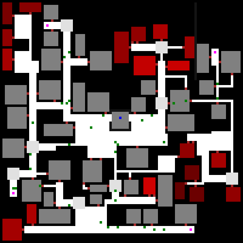
Path and seclusion visualization. If an entire half of a map ends up being secluded, hopefully that’s intentional :P (but this is why browsing through many generations is important--looking for those outliers)
Even though it’s usually obvious just from looking at the layout, open areas get their own visualizer if at least to confirm what the generator thinks is an “open area.”
Hidden doors are one of the Cogmind-specific factors I pay attention to, so there’s a mode to highlight those as well. Maps with more of these are more dangerous because enemies can use them to sneak up on the player or otherwise throw a wrench in sound tactics during a fight, but players can also use hidden corridors to their advantage to escape trouble, sneak around, or more quickly access different locations, assuming they’ve already used any of various means to discover their locations first.
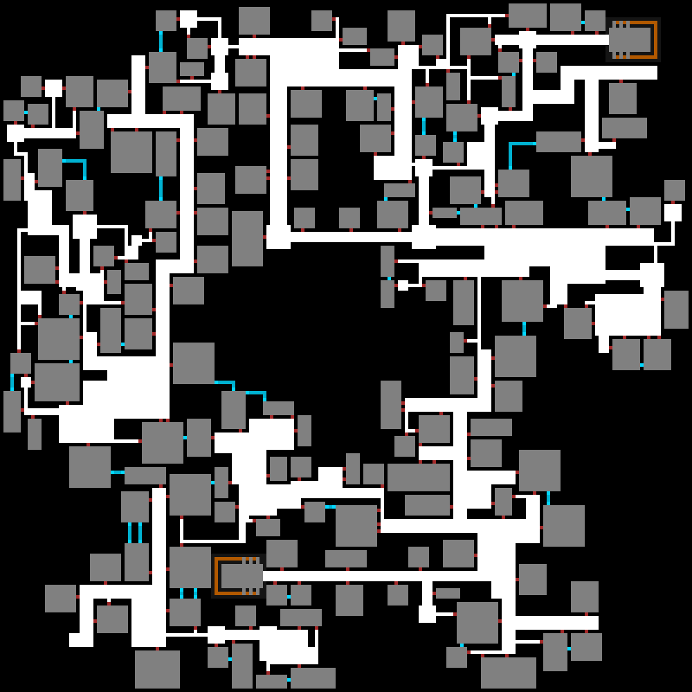
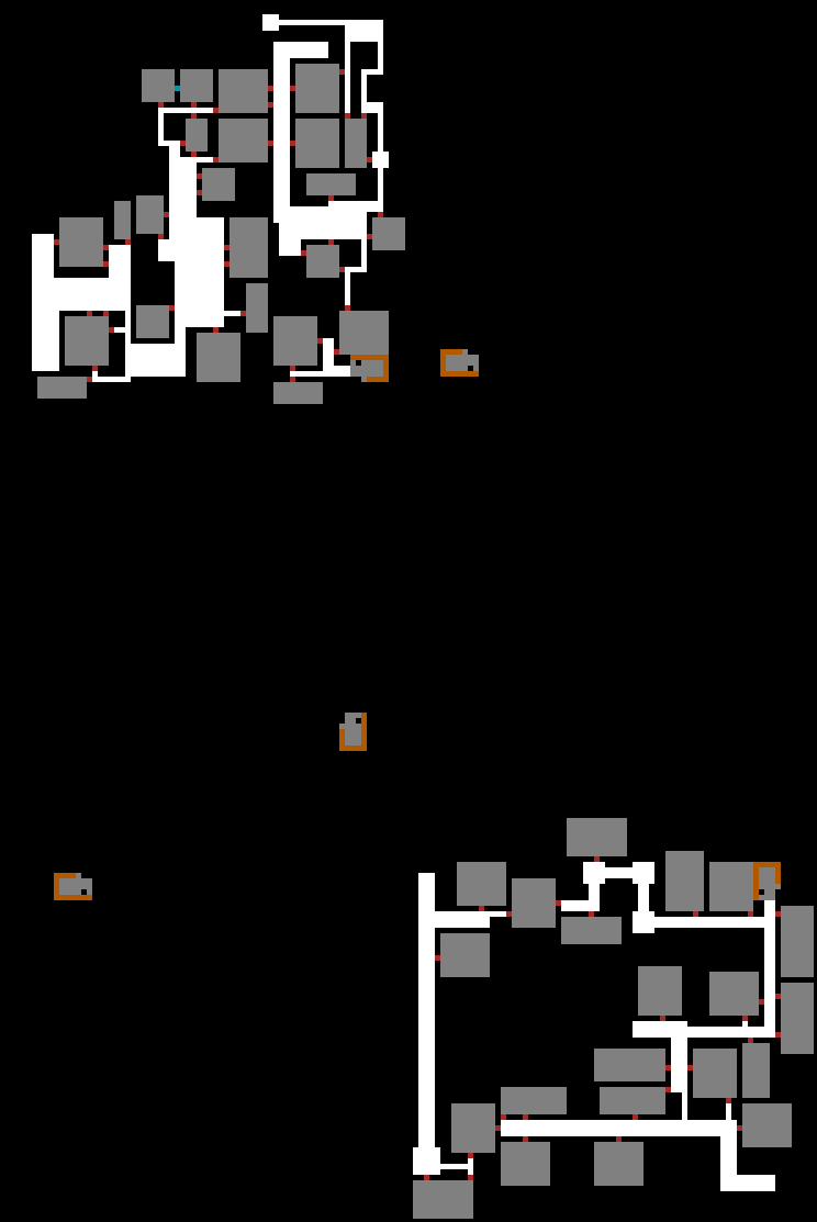
Hidden doors and corridors highlighted in blue. These are also usually the only way the map generator will directly connect rooms with one another, giving them another unique quality.
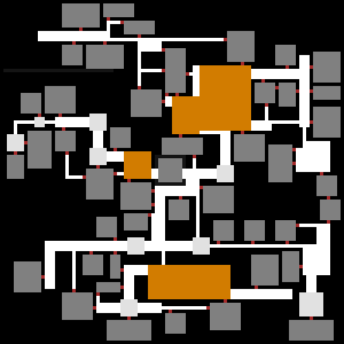
Less often used is the monochrome visualizer, which simply shows open vs. closed cells without any type detail whatsoever. Sometimes it does come in handy, though, just to get a clear picture of the possible connectedness of the map as a whole, information which may sometimes be “hidden” behind other visual distractions.
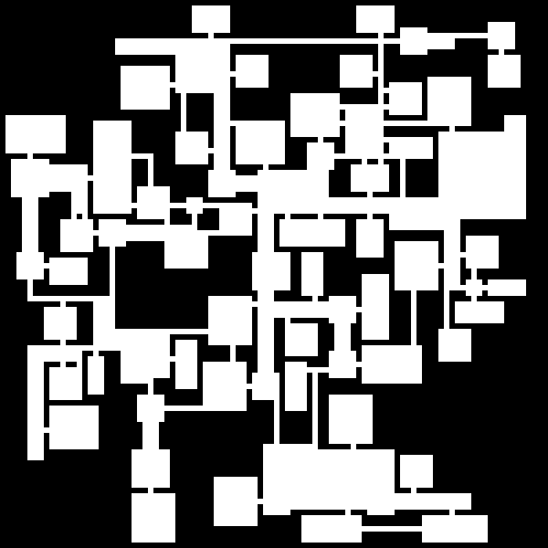
Open cell visualization for purely looking at connectedness where mobility is concerned, assuming full knowledge and/or a way past any temporary obstacles.
Aside from tunnelers, the only map features placed at this early phase are possibly a handful of special prefabs, similar to how tunnelers are placed, though I’ve already covered that under “Seeding with Prefabs” in this article.(Examples of such prefabs include the aforementioned “billboarded” branch exits.) The same article also covers post-generation embedded prefabs, for encounter purposes, along with how they’re categorized, built, and distributed.
There’s a lot more to the process for tunneler-created maps, but beyond this point it gets extremely Cogmind-specific so this is a good stopping point for now. If we do go there one day it’ll probably better to just look at one specific map type as an example.
Procedural cave maps also have some design methods of their own, but those are simpler and have mostly been covered before.
For patrons, there were more comments and discussion of this article over on Patreon here.


2 Comments
Is one of the entrance/exit points randomly chosen for the Cogmind to start at on the map, or is the starting point chosen separately? I’ve been wondering about this and noticing that the player rarely or never starts in the middle of the map.
Ah good question, I guess I failed to explicitly mention that, yes, one of the so called main entrances/exits is chosen as Cogmind’s starting position for that map (and of course the stairs are removed from that point). This is how it’s generally ensured Cogmind will need to travel some distance to reach another main exit, while being more likely to reach branch exits (or maybe a lucky random exit) before that point.
In Cogmind you pretty much never start in the middle of any map, for one because that would be much more dangerous while also making exploration likely a bit more boring, requiring extra backtracking once you’ve explored off in one direction to find there’s nothing there that you’re looking for.
For POLYBOT-7 I actually did the opposite in some cases--the player starts in the middle and can head in any direction. That’s because P7 has many more exits, generally any direction you head in you’ll find an exit, but the maps are smaller overall, and ideally you want to hop back to other unexplored areas if you can in order to permanently upgrade yourself with modules. Cogmind doesn’t really do permanent upgrades acquired through exploration, at least not on that scale, so once you find an exit you can immediately leave the map.