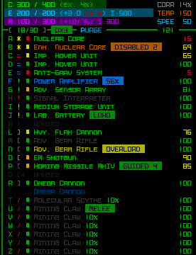
March 4~11… what a crazy, crazy week.
It wasn’t as bad as I thought it might be based on my first experience back in 2012 (this time I actually slept a good 7~8 hours each night!), likely because I’m a lot more knowledgeable than I was back then, and have lots more tools at my disposal. Still, the desire to create something awesome had me putting easily over 80* hours of work into POLYBOT-7, my entry for this year’s Seven-Day Roguelike Challenge. (*This is during the week only--excludes all pre-7DRL preparation!)
The rate of problems and solutions flying through my brain throughout the week was pretty overwhelming. Tiring sometimes, but at the same time exciting to try to find hacks that could manage so many features and content in such a short period. So. many. hacks. The technical debt is real! I was cringing as I wrote much of the code, but had little choice--take the fastest route possible or risk failure. For the first few days I was doing a slightly cleaner job of it, but with the deadline looming I started getting really crazy as the week progressed.
This project was also a little tough at times because my years of “normal” roguelike work have conditioned me to write about absolutely everything I’m doing or planning, and thinking it through to make the best decision possible. I had to get over that tendency and just do stuff--don’t write about it, do it now! Had to keep reminding myself that all week :P
This is my in-depth postmortem covering POLYBOT-7’s development, examining both the process as a whole and the reasoning behind choices made along the way.
The Concept--What and Why?
For 7DRL I originally had slightly lesser ambitions. The goal was simply going to be a “Cogmind demake,” with emphasis on stripping down my main project to create a purely combat-focused roguelike where much of the work involved would be converting the interface to a new condensed layout featuring less information but double-sized fonts and tiles. It would be something I could point people to when they’re interested in Cogmind’s general theme or style but don’t have a large enough display to enjoy it. This version of the concept was dubbed “Bigmind” :)
After thinking on it for a while it started to feel kind of boring, though. This is 7DRL! It should be about experimentation and interesting new roguelikes!
I had to get more radical, and just about the time I was thinking this I was also skimming my notes for upcoming Cogmind features, one of which happened to be a top secret “Katamari Challenge Mode” I wanted to release with a big Challenges update later this year--basically the player would act as a magnet for nearby items.
This suddenly seemed like a great core mechanic to build into the 7DRL, not to mention the ideal design would require a ton of other changes to go along with it, essentially creating a significantly different game within the same world. A 7DRL could do much more justice to this idea than a simple Challenge Mode, so this became the new direction.
Altogether the proposed changes greatly altered the Cogmind experience, and you can read a list of features similar to and different from that game in the original announcement post, though I’ll speak about a few of them in more detail later.
There are of course also a few other reasons why I chose Cogmind as a starting point to begin with, not least of all because doing so would mean I wouldn’t have to do quite as much planning and preparation, and could instead have more time to focus purely on developing any gameplay or content rather than fundamentals. Without a doubt POLYBOT-7 is a better game for it.
One of the best ways to tackle 7DRL is by reigning in scope, but another of the best ways is to base your idea on an existing game or at least a well-developed engine or framework. I’m deeply familiar with the source for my games and engine after working with them for many years, and not having to reinvent the wheel here is good because I’m actually not that great with technical stuff--in fact I’m quite slow so that’s not something I’d want to deal with under a strict time limit.
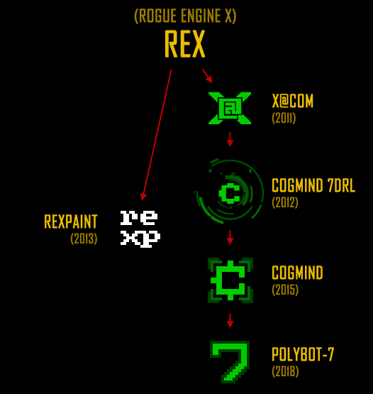
The source code from my earlier projects has been spawning newer projects over the years. I rarely start projects from scratch, just modify things :P
(That said, remember that 7DRL can be used for whatever you want, so maybe the goal isn’t to finish an awesome game but simply build an engine, or start that new framework you’ve always wanted to.)
Things weren’t all that rosy, however! Part of why I did worse this year than I could have is that I didn’t have nearly as concrete a design ready for me at the beginning of the week. Back in 2012, prior to starting my 7DRL I’d already figured out everything--all the math, formulas, and data ranges checked out, it was just a case of putting it to code and ASCII. For POLYBOT-7 I had basic plans laid out, but many details were lacking, and that’s a problem because emerging details can pretty easily cause a domino effect throughout a design. And they did :P. I ended up having to make some big changes and additions to accommodate adjustments to systems I hadn’t fully thought through before.
The biggest drawback though was spending more of the week than I’d like to thinking rather than doing. For maximum efficiency, 7DRL week should be about doing, not thinking (coming up with a good design can take a lot longer than a week, most importantly because ideas generally need an incubation period to see if they stand the test of time or maybe there’s a better approach to something). Anyway, I just barely made up for it by relying on a lot of adrenaline-fueled hacks on the coding part :)
Pre-7DRL
7DRL prep really starts a fair bit before the week itself. I went through several design docs starting back in January, occasionally opening up the latest one to make additions, then when it got a bit messy or I wanted to make a significant change in direction I’d reorganize everything in a fresh doc to get a good overview of the design state. Back in 2012 I had a lot of free time for this sort of thing, though, whereas this year I was pretty busy with Cogmind dev and other stuff, so didn’t have as much design time as I would’ve liked. I went into 7DRL with a technically complete high-level design doc, though given more time I would’ve refined it much further.
Before the 7DRL I also wrote the release announcements for both this blog and itch.io :P. I’m actually a fairly slow writer and knew there wouldn’t be time to prepare good release announcements during/at the end of the week. I did end up having to make a few modifications later based on changes to the design, but for the most part it stayed intact, all I had to do later was put together some quick screenshots. Plus this was also a good opportunity to familiarize myself with itch.io, which I’d never used before and it would be funny to somehow screw up releasing the 7DRL when it was already done!
I even designed a probable cover image before the week started, using an old unused Cogmind tileset style as a placeholder:
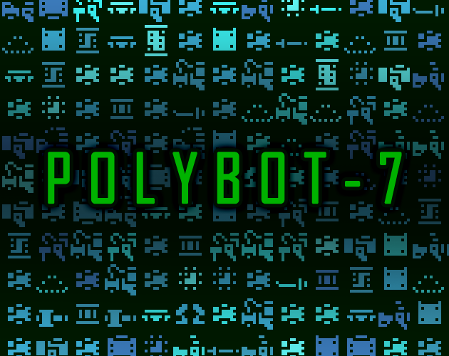
This made it easier to quickly create box art for POLYBOT-7 at the end of the week once Kacper completed the tileset. You can see the similarities :)
UI
In addition to design docs, I also spent a little time in REXPaint doing UI mockups. The initial focus was making sure I could fit everything I needed into a 106×30 grid, and I tested this early because I knew the restrictions would probably impact the mechanics.
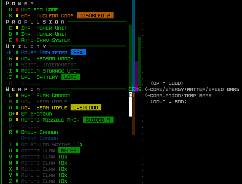
This first mockup got thrown out really fast :P
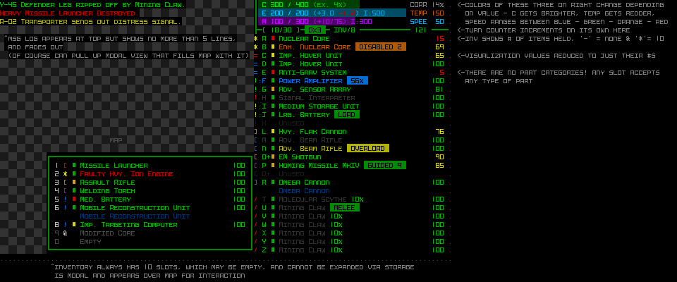
The vertical bars are way too cryptic and not all that readable, while also leaving no space for any extra related numbers. Then I realized I could give myself room above the parts list by removing the four headers/lines used purely for separating the types. I could add the ASCII/tile for each part right next to each row anyway, and they’re automatically sorted, so there’s no strong need for those headers. So next came the first serious mockup (with notes), although as you can see below it’s a pretty bad idea to have the item ASCII covering the left UI divider! (I tried that as an experiment to save as much horizontal UI space as possible)
It was also important to consider ways to adjust the overall appearance to create something as distinct from Cogmind as possible. One of the easiest ways to do that is with color, so of course my first thought (and Kacper’s, separately :P) was to move away from green and try out a different main UI color, specifically orange. Gold on black is a cool theme, as you can see in this inspiring DynaHack screenshot.
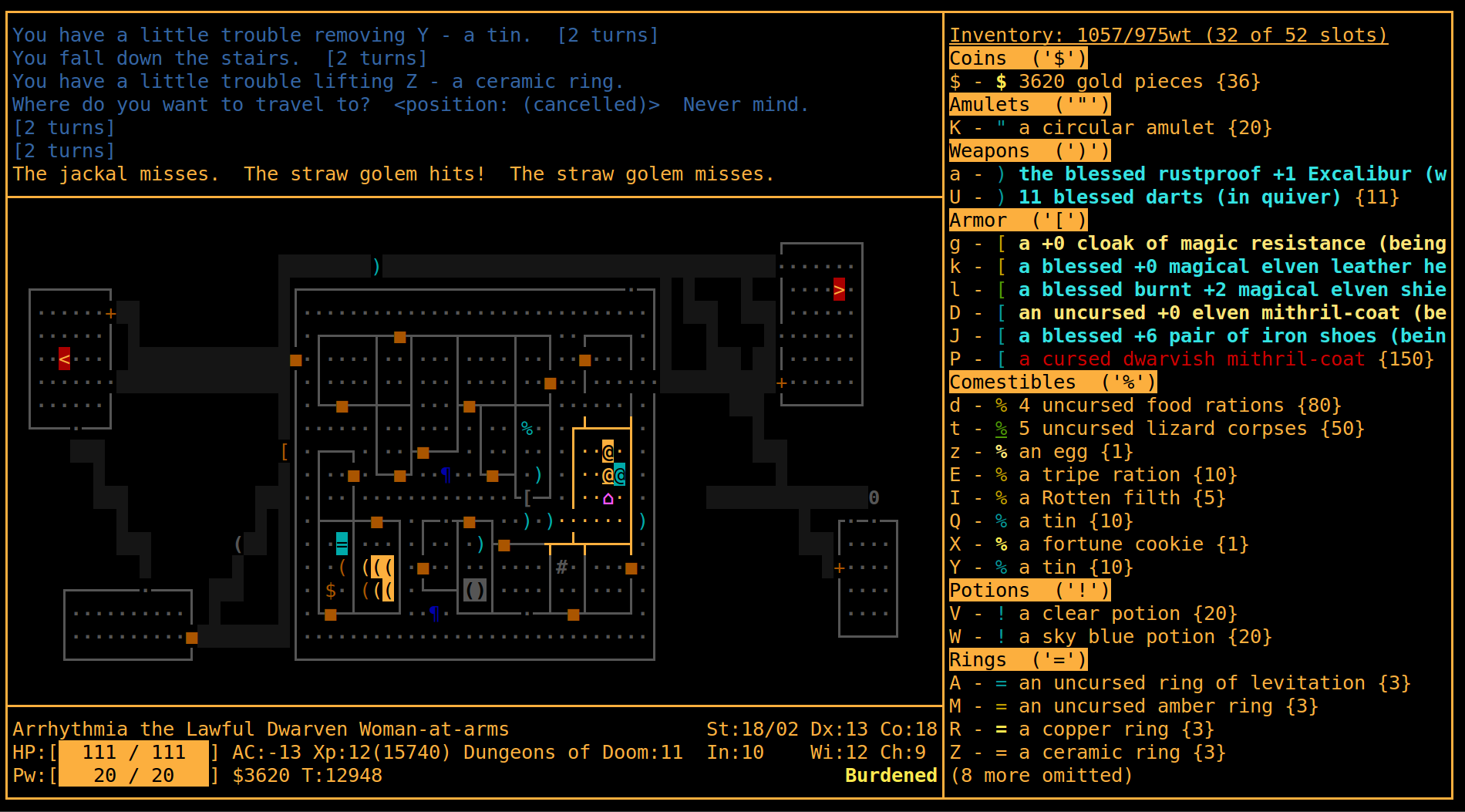
Sample screenshot of DynaHack with a modified color scheme.
I explored the idea in REXPaint, but unfortunately from an overall UX perspective orange really isn’t all that suitable given POLYBOT-7’s mechanics. Like Cogmind of course item destruction is a major feature, and the whole color scheme is geared towards green being “good” while other effects and states use their own logical colors. In most cases anything not green probably deserves closer attention. This also preserves the standard “green -> yellow -> orange -> red” progression for damage indicators and labels, a theme applied consistently across many parts of the interface. Changing the main color would mess with that intuition and make the UI at least somewhat harder to parse.
So with four extra lines at the top, a decent final HUD mockup was born:
I made some other adjustments later, but we’ll get to that. In any case, once a REXPaint mockup lays everything out as clearly as it does, implementation is fairly straightforward so having this ready beforehand was very useful.
Also with regard to color, I decided that rather than once again going for the same old high-contrast black background style, I’d switch over to a low-contrast theme that relies on a slightly darker foreground on top of a slightly brighter background. Late last year I added “render filters” to my engine (described earlier on the blog), which make enabling a low-contrast look as simple as changing a config setting. At the time I didn’t know I’d end up using it here--the system was just meant to provide Cogmind players with a way to tweak their interface, but it sure came in handy!
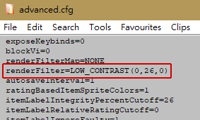
That line in the config file is what keeps the foreground from being too bright, while also adding a green tint to the entire background.
However, the low-contrast filter itself is a pretty big hack, and as one might expect, Cogmind having been designed all these years with the assumption that the background is black meant that the mode doesn’t always look perfect in combination with the animations. While there certainly wouldn’t be time to update the huge number of particles used for weapons, I could at least get the UI looking better. These changes were all made to Cogmind (which benefited in several ways from this 7DRL :D), something I wanted to do eventually but in this case moved up to before the 7DRL.
There were basically two types of issues to resolve: either forcing a background meant to be black even in low-contrast mode, or modifying animations to lerp from a given color to the desired background color rather than assuming black.
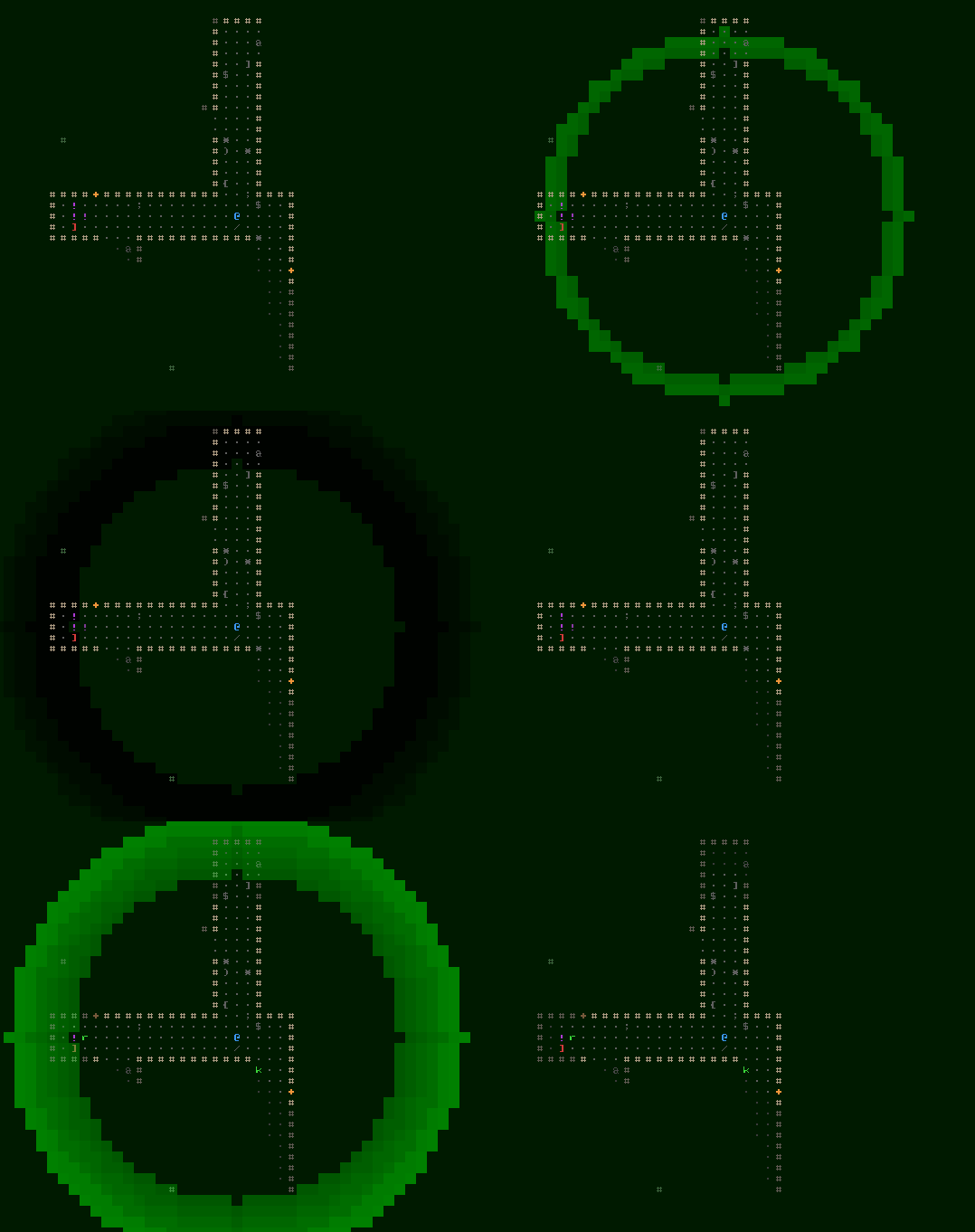
An example of the latter case, notice how before the fix the animation lerps to black rather than the proper color (effectively going to black before snapping back to the right color), and looks much better (as intended) after it knows the proper target color in the first place.
Fonts were also something I thought about a lot before starting. I wanted something simple--both in terms of appearance and implementation, so I went with Terminus for both the text and map, because it’s a nice and readable pixel-perfect monospace font available at pretty much all sizes. But because I didn’t want to have to provide a massive range of sizes like I do with Cogmind (it takes forever :P), instead of allowing the map view (and HUD) to expand vertically it is locked at 30 rows. The width is still variable, resulting in letterboxing on some displays. This is a much prettier option than scaling, in any case, allowing both text and tiles to retain their pixel-perfect look, straight from the bitmap.
It also means the entire range of resolutions can be pretty well supported with only four different sizes, all created from a single base size. With a base square map tile size of 12×12, a 768p resolution uses a 24×24 font (simply created via 12*2), by far the most common 1080p resolution uses a 36×36 font (12*3), and beyond that there are also size 48 (12*4, 1440p) and 72 (12*6, 2160p). Text uses half-width cells that also need four sizes, based on base dimensions of 6×12.
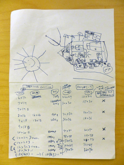
Some of my pre-7DRL notes. I carry folded pieces of paper in my pocket while out and about to jot down ideas, and my son decided he wanted to borrow this one and draw on the back while bored :)
Gameplay Design
The main goal of the design was to create a quick, very coffeebreak-length Cogmind-ish experience, so everything revolved around that. There should be fewer decisions involved in a normal playthrough, and thus many systems or interactions would need to be removed. And not just systems but even weapons’ visual effects, which are blocking and therefore can slow down the player. With that in mind, during the week I wanted to tweak any slower animations, or outright remove most weapons that relied on them.
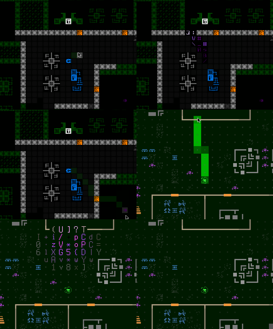
Comparing Cogmind’s EMP animation with the faster one in POLYBOT-7. (EMPs in particular I wanted to keep for mechanical reasons, so those had to be sped up.)
Another huge decision-saving move was to completely remove the inventory, though it took some time to come to this conclusion. Notice the inventory in mockup #2 above, which was at first envisioned as a modal window that would allow collection of parts to then attach at will. Time-consuming! Even with all the supporting automation features it provides, one of the more time-consuming aspects of Cogmind is inventory management, and I thought it’d be great to limit that. So the next thought was perhaps an ordered “queue” of parts that would be attached next after you lose some, but even that seemed too complex for what I wanted to be a simple, focused game.
It dawned on me that there really wasn’t a strong need for an inventory at all--basically the world was going to be the player’s “inventory,” facilitated by the already established ability to quickly attract surrounding parts. This would be both simple and have lots of interesting implications for play.
Once attached, parts cannot be individually removed because that would make it essentially pointless to automatically attach parts, with players just removing those they don’t want while others are nearby (more tedium!). So aside from losing one to destruction (a slow and unreliable method), there needed to be a different way. Enter another key part of the plan: the “Purge” mechanic.
Cogmind already has a “go naked” command that destroys all attached parts to allow for a quick getaway in certain emergencies, and it seemed like repurposing this for POLYBOT-7 would make it a much better game. Instead of destroying all parts, it could destroy a random half of them and drop the other half, allowing the possibility of keeping some potentially good parts while also not requiring that there be a massive number of parts nearby to return to full slot usage. This mechanic would allow players to “shuffle” their build if 1) it became totally imbalanced and unusable or 2) they found some really good/better items that they want to take advantage of right away.
From talking with Cogmind players (I introduced the general plan to them the week before), it became obvious that allowing unlimited Purging wasn’t going to work and could easily be gamed, so I decided to have it charge up before each use, achieved by draining some of the player’s energy in the meantime. This could be interesting because it would be ready faster if you had more power, but also make the player weaker for a while after a Purge, forcing you to seriously consider your situation before taking this action. I’ll talk more about this later, because there were issues and that’s not how it works now :P
I’ll also talk about other unique mechanics when we cover what actually happened during the week, starting with the next section :)
This post is the first in a four-part series. Subsequent parts will dive into the following topics:
