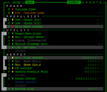
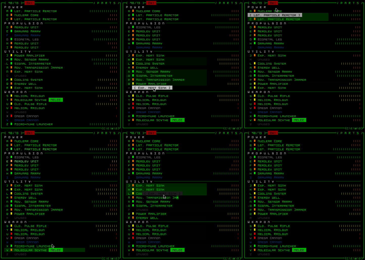
Today I’d like to share the process behind the development of a singular UI feature, in particular the part (equipment)-sorting implementation, which is a good example of taking a simple premise and working it one step at a time, examining the results of each new element added throughout the process until as a whole it satisfied (and even exceeded) expectations.
The Issue
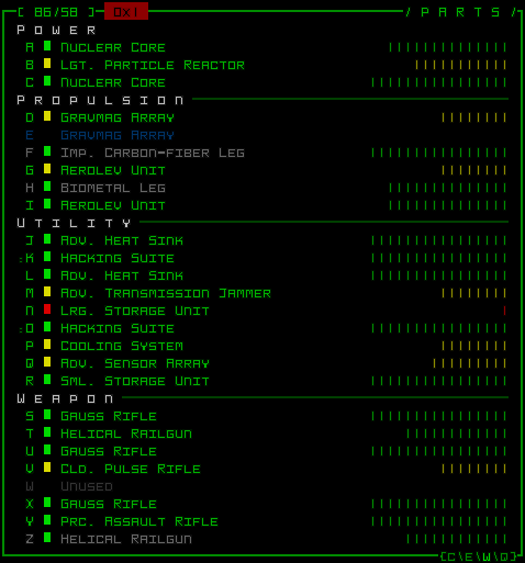
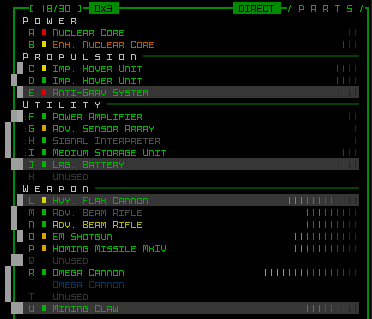
Inventory turnover is quite frequent in Cogmind (more on that here), and the result is almost inevitably a cluttered list of equipment in the HUD, especially later in the game when you can equip a couple dozen different parts, and especially with utilities, the most versatile category of parts capable of a wide range of functionality.
While playing I’ve found myself sometimes having to take time out to reorganize that list, grouping multiple parts with complementary effects like heat sinks, hackware, or other processors to better understand my build at a given time. And I know that some other players do this as well, as having a list of equipment that’s easier to parse facilitates rapid decision-making and avoids otherwise unnecessary mistakes.
So what we needed was a way to quickly and automatically group identical parts, or parts with similar functionality.
Initial Work
With interfaces there’s of course the important question of how to present this feature to the player, but in this case I didn’t start there, having only a vague idea of how best to do that. Instead, it made more sense to start with something more fundamental--without regard for appearances, the first step was to simply make sure the sorting algorithm itself worked, and just display the final result.
In game development, piling on too many features at once, even just multiple facets of a single feature, unnecessarily increases the complexity of the task. Everything should be broken down into the smallest understandable pieces so that any bumps along the way can be smoothed without too much confusion as to where the problem might lie.
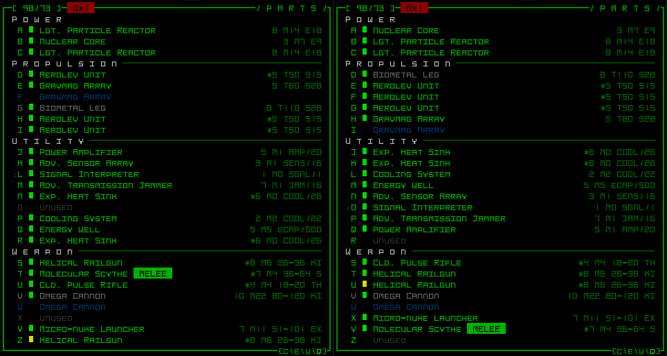
Where the sorting is concerned, nothing special is going on, it simply reorganizes items by moving all empty slots to the end of their own category, while the items are listed in ascending order determined by comparing each item’s internal database ID number.
As expected, that didn’t quite work so well the first few times I tried it--bugs here and there, crashing immediately the first time I tried to use it (this is common :P), and on subsequent attempts doing odd things like stacking a bunch of items on top of each other, or erasing them completely -_-
All issues were resolved quickly, though, because the code was unburdened by whatever else I’d end up doing later to improve it for the final iteration.
Animation
It’s no secret that I like to animate everything I can, so it’s never a question of if, but how. Animations not only have a lot of potential cool factor, but when done right can also provide good visual feedback for an action or command.
For the sorting I decided to start out with something really simple, which would likely not be good enough for a permanent solution but required the same code along the path towards where I felt like I wanted to head, anyway. Basically the idea is rather than “teleporting,” items should somehow actually move, so I started with just having them slide directly from their current slot to their destination.
To accomplish this, I repositioned entire subconsoles themselves as part of the animation, which is an approach I’ve actually never used anywhere else in the interface, though is something I’ve been looking forward to doing for a long time. (For a detailed look at what I mean by “subconsoles,” see this piece I wrote on Cogmind’s UI implementation.)
The result is better than nothing, but with all the items shifting over one another it’s really hard to tell what is and isn’t moving, so the animation doesn’t add anything of value to the process.
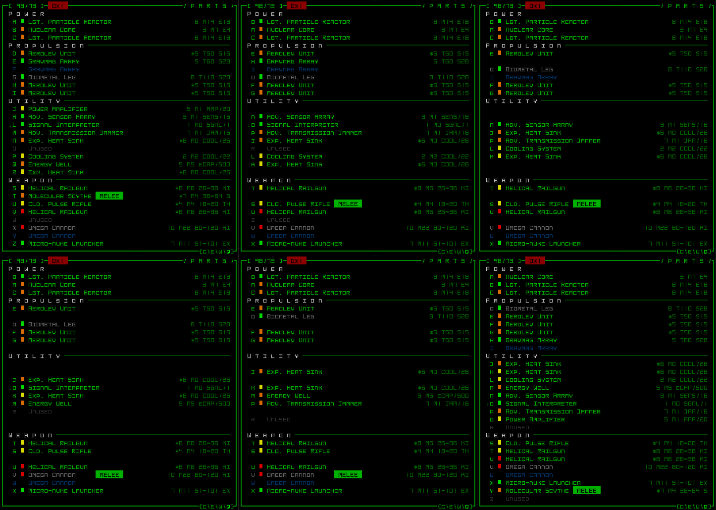
A better way to make it more obvious what is moving is to shift them along more than one axis, i.e. offset them a little to one side.
At the above stage I also wanted to try and convey some information in the amount of offset, specifically that items moving further from their previous position would travel along a wider arc, like so:
But the effect was a little too messy for my tastes, especially since the coarse grid resolution of a strict terminal interface doesn’t leave any room for gradual pixel offsets (a rule I’ll not break in Cogmind for any reason). Items are either barely offset, or offset quite a bit.
Note: I originally thought I’d have some of them, perhaps the empty slots, offset to the right while everything else moved along the left side, but assumed that would reintroduce too much chaos.
Seeing as the distance-based variable offset was causing a problem, I just removed the variability, setting them all to use a static animation offset whether they were moving to an adjacent slot or to a position ten slots away. At this point I also changed the movement path from an arc to a straight up rectangle to make it easier for the eye to follow given the grid.
With the desired movement path more or less determined, I saw that when many items were moving at once, while you could sorta tell which they were, it would be far more helpful if the movements were easier to follow, and the first way to tackle that is to simply not do them all at once!
Thus each item is “staggered,” beginning its movement animation at a random time within an acceptable range from when the command is entered (in this case 0~700ms). Each item takes 300ms to reach its destination, regardless of the distance, so the entire animation will take no longer than 1 second, regardless of the number of items involved.
In addition to the staggering, it was also time for some cosmetic enhancements to moving items in order to further improve readability. Two such effects were added:
- Any item that will/is/was moving will have its reference letter repeatedly replaced with a random one for the entire duration of the sort. The letter is going to change anyway (because it’s moving to another position in the alphabetical list), so rather than just have it suddenly change, why not spruce it up with a little something? This also works well in combination with the staggering, since any given sorted item is only moving about one-third of the time during the sort, but even while it’s not moving you’ll be able to identify which those are.
- On arriving at its final position, an item will flash white and fade back to its original colors, a process that takes 400ms. The flash reinforces which items just moved, and just plain looks cool. To me this plus the staggering really makes the whole effect :D
Oh yeah, and there’s a little beep each time an item reaches its destination :D
From inception to its final form, this process took approximately four hours.
Notes
Other considerations encountered during implementation:
- Item order doesn’t normally hold any meaning, except with weapons, which when active will fire in the order listed. For strategic reasons some players may prefer that certain weapons to fire first, so in that case it was necessary to add an option to ignore them for sorting purposes. Sorting was primarily meant for utilities, anyway, and to a lesser extent propulsion. I do a lot of weapon toggling myself, but don’t really care about their firing order, so I’ll be happy to sort them with this new feature :)
- Further improvements could maybe include the option for fully automated sorting which operates immediately when a part is attached, so the player never even has to use a command to do it manually. Less impressive than seeing a bunch of items being sorted together, though :P
- The current system doesn’t yet take into account integrity differences between items with identical ID numbers (this is obvious with the Exp. Heat Sinks in the final sample, as they reverse positions twice), so there is still room for better consistency and other sorting improvements.
