Few roguelikes are without some kind of inventory system, as it’s a familiar and flexible way to provide access to the tools a player uses to overcome challenges. Regardless of however many items an inventory might contain--2, 26, 52, or something else--how it interacts with the rest of the mechanics, as well as how the player interacts with the system itself, both play important roles in shaping the player’s experience.
With Cogmind in particular, there is a huge amount of inventory management involved in regular play. By comparison, with many roguelikes you settle into a set of equipment that only changes when you find some better individual item, rather than when that equipment has simply been damaged too many times, or an enemy suddenly gets a lucky critical hit that destroys one. In Cogmind all attached items essentially act as physical shields that protect you to varying degrees, and they can all be destroyed. According to the combined stats of reported runs from the previous version (Alpha 8), 43.5% of all items players equipped were destroyed before being removed or replaced. That’s a surprisingly high number for a roguelike, but is of course something the player expects and can prepare for. (Note that for the purposes of this topic, “inventory” also includes “equipment in use,” thus bringing the number and types of slots into play. These concepts are essentially inseparable with regard to the management aspect.)
Back in 2014 during pre-alpha development I wrote an article on Inventory Management (hence this title’s “Revisited”), that one explaining the purpose of inventory and the ideas behind dynamic inventory size and decision forcing. Since then however, there have been a few changes, and certainly an expansion on the interface side of things, altogether enough to warrant another more in-depth look.
UI
From a UI perspective, with Cogmind an important goal of the inventory system was to make interacting with it as simple as possible. As one would expect with a system marked by high turnover, there’s a lot of item removal, equipping, and swapping to be done, and the UI had to be designed to facilitate that.
With such a variable inventory state and the relevant actions being quite frequent, priority #1 is to keep the number of required commands down. The first step towards achieving that goal is to ensure both the inventory and equipment are visible on the main GUI, thus they occupy a non-insignificant 29% of the screen space at all times.
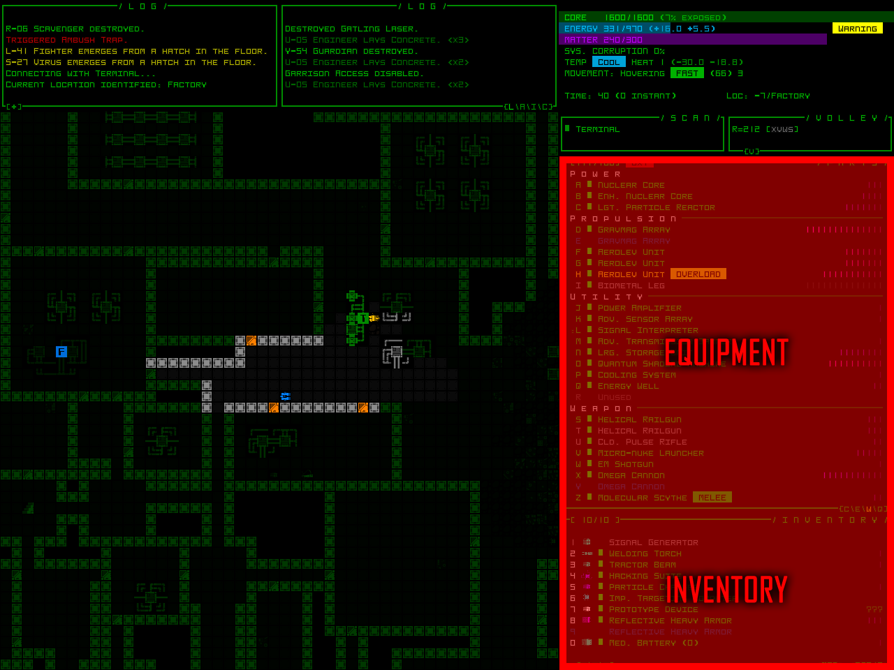
The base 4:3 layout for the main interface, with dedicated inventory/equipment areas highlighted. Even the 16:9 layout is 24% inventory.
Without the need to open a separate menu for inventory actions, the number of commands is already cut in half--a minimal OPEN > SELECT > EQUIP > CLOSE becomes SELECT > EQUIP! But there are many ways to do even better than that.
On the mouse side, Cogmind supports drag-and-drop inventory management, allowing mouse-using players to just drag items where they want them to go. This is the most intuitive method of item manipulation for beginners, helping keep the barrier to entry low.
The dragging doesn’t even have to be to a specific location--items will automatically be equipped to the first applicable slot, or if there is no room then dragging to a specific target allows it to be swapped. Drag to the inventory to unequip, drag to the map to drop… Also for mouse users, ctrl-clicking an object on the map bypasses the inventory completely and equips it.
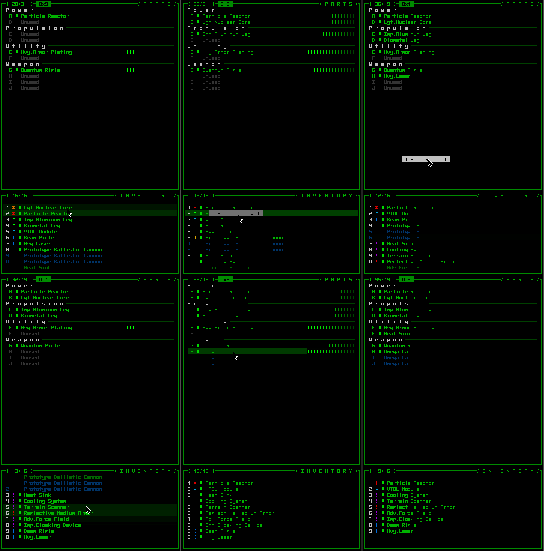
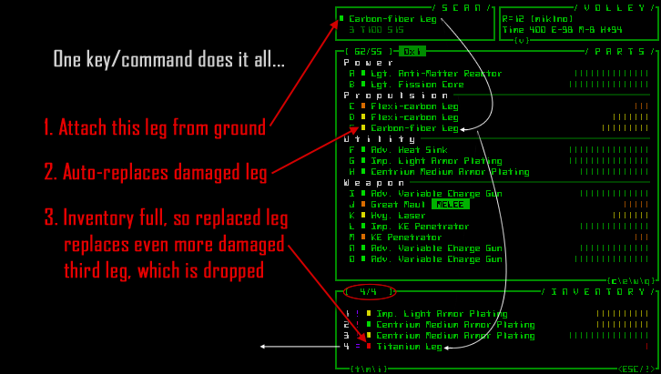
But playing with the mouse isn’t necessary, and pure keyboard players have access to a number of extremely convenient features as well. In addition to single-command equipping (Ctrl-#), single-command unequipping (Alt+Letter), and single-command dropping (Alt-#), items can be equipped directly from the ground with the ‘a’ key, in which case if there isn’t any free space they will intelligently replace a current item that is outright inferior, and if the replaced item is better than something in the inventory, it will be stored and the worst item will be dropped instead. (The same system applies to equipping items from the inventory, and picking up items from the ground (‘g’)--all of them use the same automated system.)
Here it’s worth mentioning a helpful aspect of Cogmind’s design contributing to inventory management’s simplicity: only one item may be present on the ground at a given location. So when you go to pick something up there is no need to specify what it is you want! Very handy. (This same feature aids rapid assessment of what items are nearby, compared to some other tactical grid-based games in which you may be faced with stacks of items, requiring a more indirect way of seeing what they are and therefore adding an extra layer of abstraction between player and items.)
Strategy
So how many items are we working with here? Cogmind only has four types of equipment slots--power, propulsion, utility, weapons--and starts with seven slots divided evenly among them (only one for power). That slot count, which equates to the number of items that can be in simultaneous use, gradually increases to 26 (that number oh-so-common in roguelikes for obvious reasons :P). Using a common humanoid system as a comparison, that’s like having a character with several heads and bodies, a couple amulets, all 10 ring fingers, and numerous arms and legs. Cogmind’s pure inventory, on the other hand, is rather small compared to most roguelikes, with a base size of only four, though that size is flexible depending on the player’s strategy. It can increase to 20~30 or even more if the player is willing and capable of devoting enough of their slots to storage space. The average peak inventory size of all reported runs in Alpha 8 was 8.78 items, though an average of only 5.03 items were carried at any given time (wasteful!). (The first post about inventory management talks more about flexible inventory sizes.)
The trade off is that extra storage is heavy and slows you down, so the tankier the build, the more likely it can maintain a larger inventory capacity (and will also probably need one due to increased combat attrition as a slower mover).
For balance purposes, back in Alpha 6 I did remove the largest inventory expansion module, Hcp. Storage Units (+8), otherwise we’d likely be seeing a higher average capacity. Now the heaviest single-slot inventory boosting item gives an extra six slots. Some players like to stack two or even three of those to get an inventory size of 16 or 22. The largest recorded inventory capacity in Alpha 8 contained 28 slots.
Still, a large inventory is not always necessary, and a game can be won simply on the back of the versatility afforded by a couple dozen pieces of active equipment. That and with the removal of Hcp. (“high-capacity”) storage, it’s a little easier to reach the point where the slot cost of maintaining a given inventory size reduces a build’s overall effectiveness (because storage doesn’t do anything but hold spare parts :D).
About slots: Most items only occupy a single slot, to facilitate swapping and avoid unnecessary complexity (in terms of design, implementation, and most importantly on the player’s end), but some less common special-purpose items might occupy multiple slots at once (usually just two, though there are a few items even larger than that). I added that feature (which didn’t exist in the first prototype) as a way to enable another type of “cost” that could be traded for some benefit.
More UI!
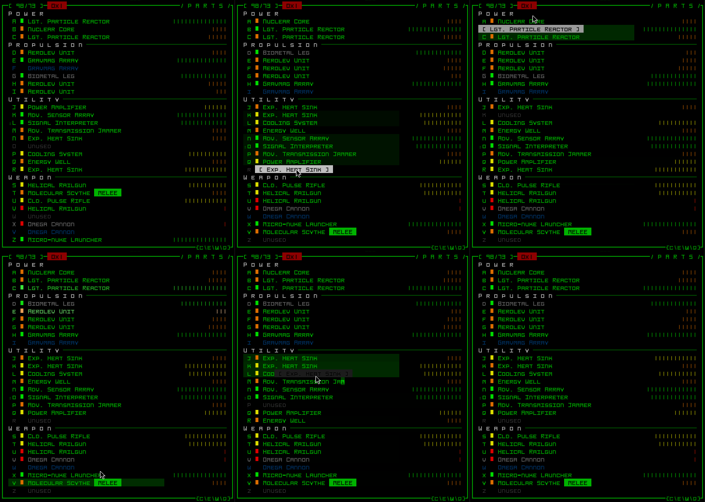
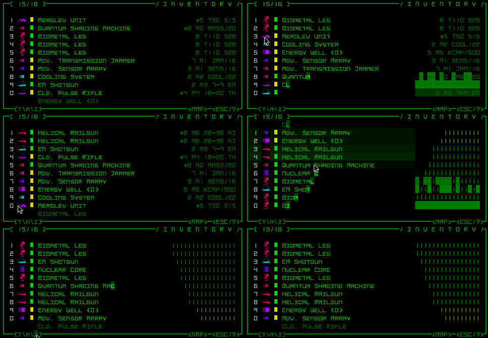
An important consideration when you have so much in the way of items/equipment to manage is ways to organize and compare them. To that end, there is a feature that sorts attached items by subtype so that same and similar items can be grouped together, quite useful when you have a couple dozen pieces of equipment divided into only four slot types.
The inventory can also be forward- and reverse-sorted by mass, type, and integrity (all three accessible by both keyboard and mouse).
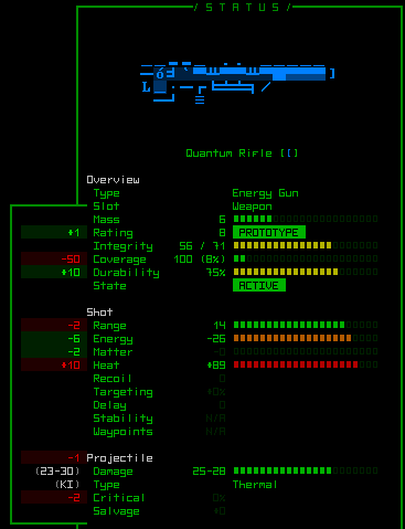
In terms of additional information, the space out to the right of items is used to show stat visualizations, of which there are currently six:
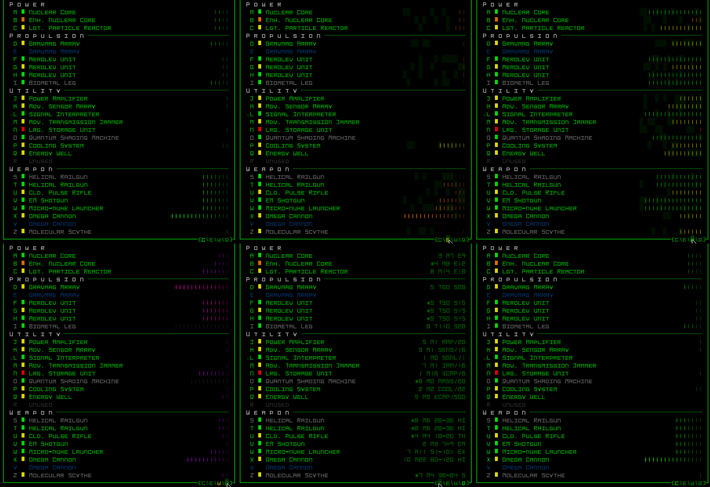
Cycling through item data visualizations: Coverage, Details, Integrity, Energy, Heat, Mass. A seventh will be added soon, and we’ve recently been discussing the possibility of adding yet more alternative graphs to suit other player preferences.
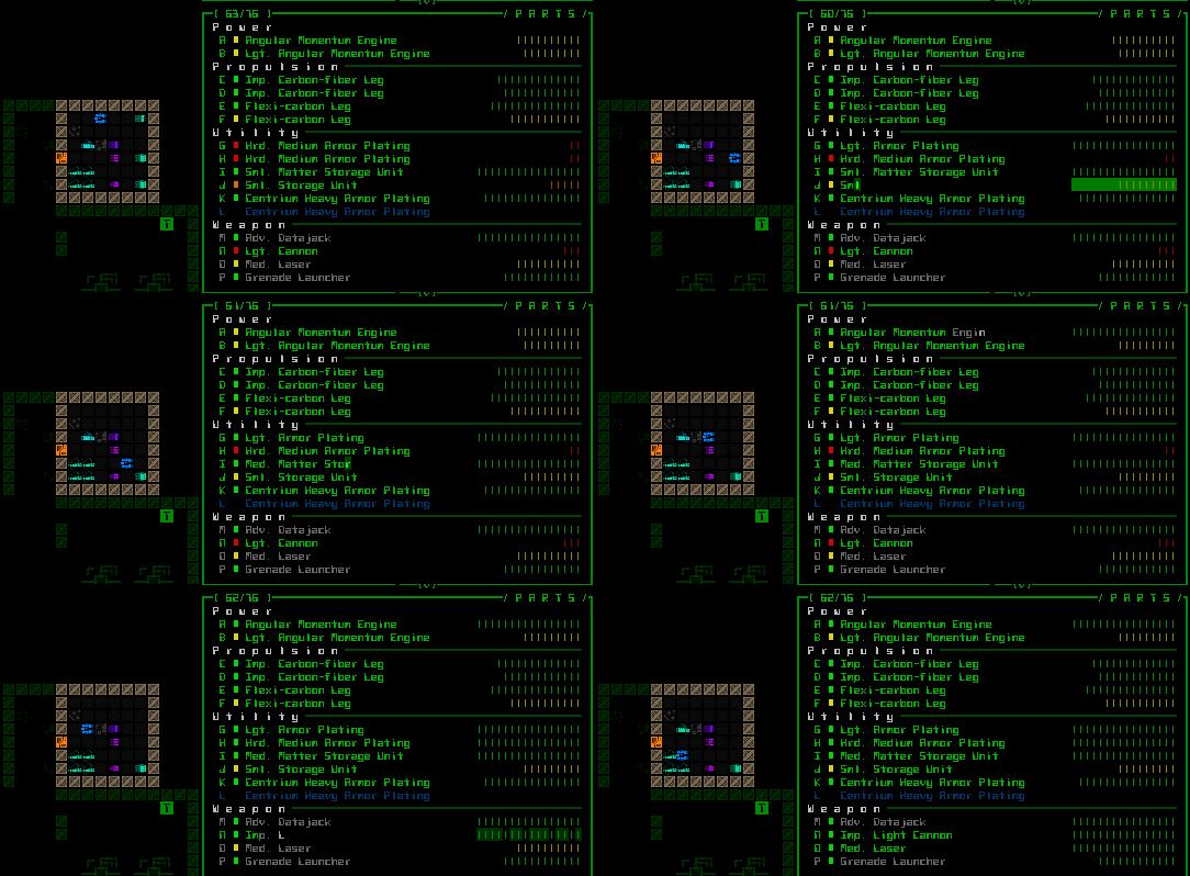
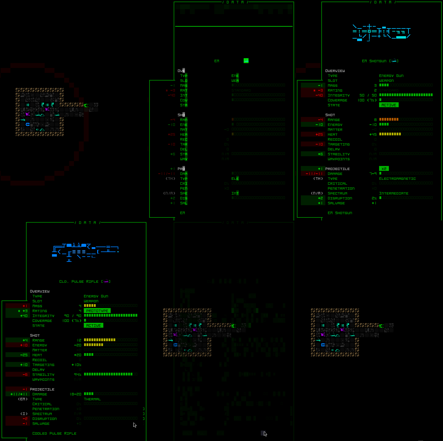
Frequent swapping of items (of which there are quite a few) is also made easier by side-by-side comparisons that highlight any differences.
All these features combine to support the inventory management aspect of the game, and players of course really like it when whatever they want or need to do is easy.
The primary remaining imperfect aspect of the inventory management system is dealing with very large inventories, because the inventory displays no more than 12 items at a time, of which you can only interact with 10 (since the two at each end are themselves scroll buttons).
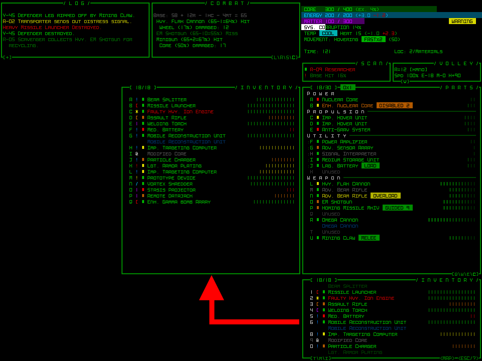
At one point on the forums we were talking about a special “inventory management” mode that could involve a temporary window displaying the full inventory contents and make it easier to do multiple inventory actions in a row. Maybe something like this:
But since then, with somewhat smaller inventory sizes (no Hcp.) and a large number of convenience features (above), I’m pretty sure this is no longer an issue worth introducing another major interface feature for. Also, as of Alpha 6 processors and hackware can no longer be repeatedly swapped out, which was the primary cause behind a frustrating amount of inventory shuffling for optimal play, so it looks like the issue has solved itself through other evolutions in the game. (Update 161011: Okay, so this did get a neat new UI feature associated with it :D)
Still, every time it seems like some part of the interface is done, another way to improve it pops up for some reason or another, so I’m sure we’ll be seeing yet more in terms of inventory management features :D
