I recently added the third and final dialogue-related UI feature to Cogmind, so it’s time for a review of what all these different ways of displaying who says what are doing in the game :D
Message Log
This is the obvious one--any NPC dialogue is added to the message log for future reference if necessary, especially useful if you’re told something that might be important, like a unique terminal access code you didn’t bother to write down :).
Like most other uses of the message log, however, it plays a secondary role with regard to dialogue, while the primary method of display depends on whether the speaker is a minor or major NPC.
I’ll write more about message log itself and its design another time.
Transmission Window
Major NPCs open a modal dialogue box when they talk to you, reflecting their importance to the story. They also get their own window because they’re likely to have a lot more to say at once than the average NPC.
Players already familiar with a given conversation can just ESC out of it.
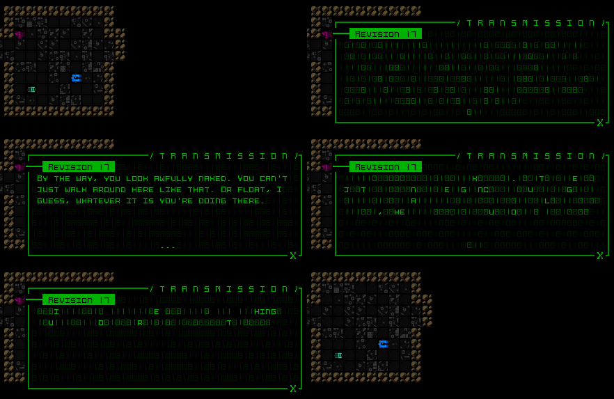
One significant advantage of putting this dialogue in its own window, besides modality, is tighter control over pacing. By dividing a longer conversation into segments on separate pages rather than having it all suddenly visible in the log, each page switch can represent a pause in speech which is reflected directly in the player’s UI experience, even just for the moment it takes to advance the conversation, which can be useful for conveying feeling beyond the words alone. Revision 17’s initial dialogue includes an example of this technique (and a glaringly explicit one at that):
“If I know the one behind it this can only be bad. And trust me, I know that one all too well…”
“…”
“I give you a hook like that and get nothing? You know, you’re pretty boring to talk to.”
On-Map Dialogue
This is the newest one, showing dialogue from minor NPCs, and might even be considered redundant since the message log has always shown this same content, but there are good reasons for wanting these to appear on the map as well.
Cogmind’s message log is afforded relatively little space, and the overall interface design intentionally de-emphasizes the log by providing the same useful information elsewhere in the interface via more convenient, accessible, and relevant means. But even a minor NPC might tell you something valuable or interesting. I know I tend to ignore the log for 99% of play time, so when something does come along there’s a chance I’ll miss it. Thus the non-log parts of the UI are responsible for re-emphasizing anything that should be known, dialogue included (which is kind of a special case, anyway, since there’s only so much of it).
My original concept for on-map dialogue had a secondary goal as well--use a larger font to make the dialogue more readable than when squished into the log, but the map font is a square font and therefore not exactly more readable despite being technically larger, so that approach was scrapped. (Later testing showed that wider space available for dialogue displayed over the map was already somewhat better for readability compared to the log window, anyway.) At least the fact that these lines appear on the map rather than only alongside mundane messages in the log achieves the primary goal of emphasizing them.
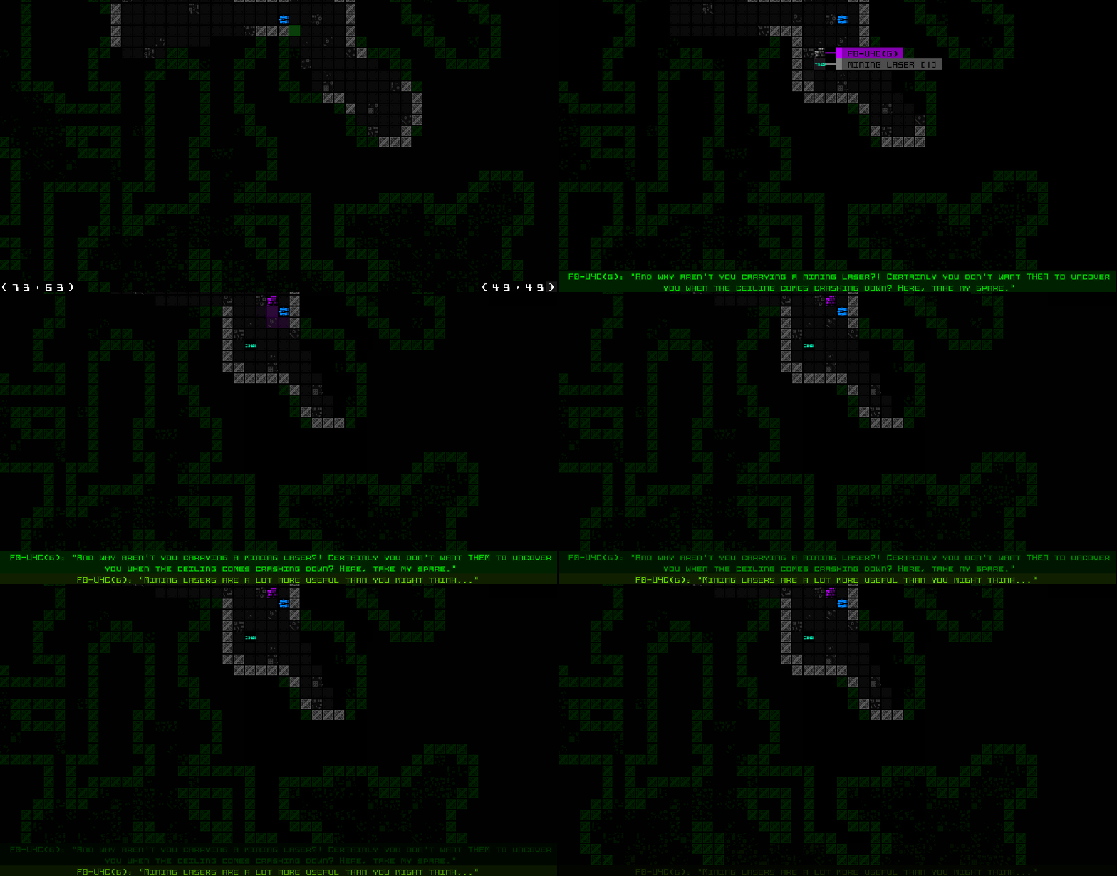
There are other unique advantages to map-based dialogue, but before we go there let’s look at the first implementation:
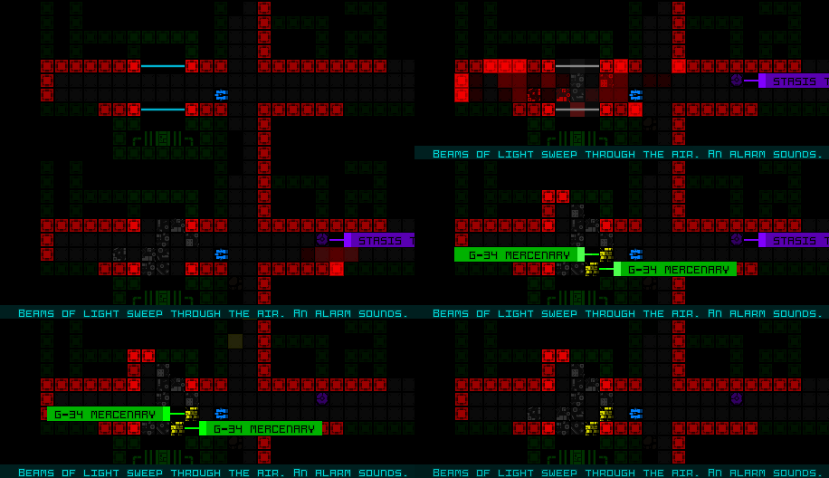
The first test looked pretty good. You’ll see a quick line flash between the speaker and the new line, to indicate their position, and the spoken dialogue flashes in. New lines are added to the bottom, since reading downward is more natural, and it looks better when old lines fade upward into the map. (These lines are not modal, and will simply fade away with time.)
This first test also took into account the need to differentiate between dialogue from different speakers (or wrapped lines from a single statement), by alternating between slightly different hues.
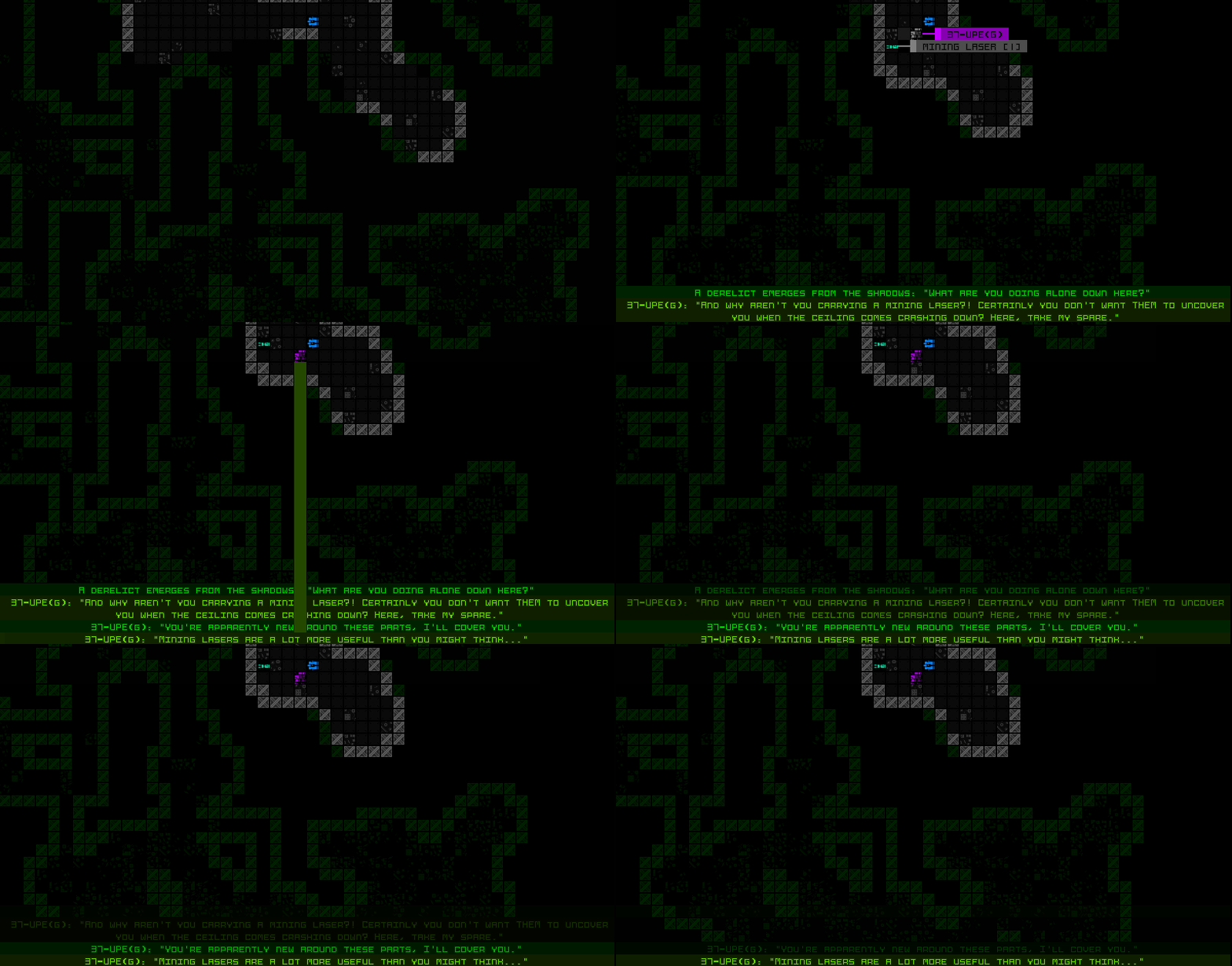
There were still several subtle ways to improve on the animation, so I tweaked the short-lived speaker position indicator line to appear smoother, and added a very fast swipe to each new dialogue line, originating from where it’s connected from the initial indicator line. The latter addition makes it a little more obvious which and how many dialogue lines are new, plus it just looks cooler :P
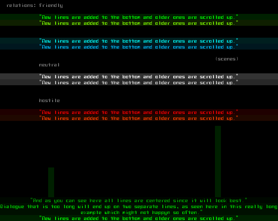
More colors are also helpful--the color of on-map dialogue messages reflects the relationship of the speaker with Cogmind, making them more informative than the log (which can’t effectively do the same because there are already other uses for those colors there!). As one would expect, green dialogue is from friendlies, gray from neutrals, and red from hostiles. (Note that the swipe speed also had to be tested on wider map view settings, which is what the speed values are based on, since there’s more distance to cover under those circumstances.)
As you can see in that mockup, there’s also some blue in there. After finishing the dialogue feature I couldn’t resist giving “scene descriptions” the same treatment. Sometimes the log will show a cyan description of a unique encounter or event (these are often accompanied by dialogue, shown in sky blue), and these, too, will now appear over the map.
Future posts will look at the role of NPCs and story in Cogmind and roguelikes, though I might not get to those in the near term, as those parts of the game are still taking shape. (I’ll also have to tread carefully around those topics, because I don’t want to spoil anything!)
Update 161110: There is now a complete series of articles on story in roguelikes, starting here!



2 Comments
Damn. More huge successes. I don’t know that any game studio of any size pays as close attention to design as you do. That last gif makes me think the cogmind format would make for a great dungeon crawler as well…
Heh, well I don’t know about huge, since this newest feature was just tacked onto the existing system, but I do like to have reasons for every decision, and it’s nice to have a place to share and record them :)
Certainly there are plenty of smaller indies who are big on the details, but I think that’s a natural result of projects of passion as opposed to being driven by money. I’m happy it shows :D