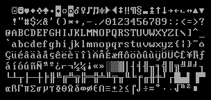
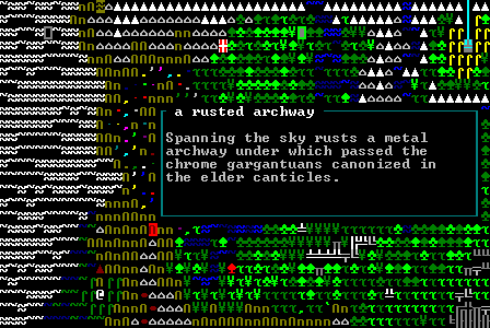
The first aspect of a traditional roguelike viewers tend to notice is the color palette, but when it comes down to actually playing a game which requires interpreting large amounts of text, color takes a backseat to the importance of the font. Characters/glyphs form not only words and sentences, they even represent the map and every object contained within, blurring the distinction between font and sprites/tiles. Thus roguelike developers should not overlook the many considerations that go into creating or choosing the right font. This is the first post in a series that will explore those considerations, share font creation techniques, and look at examples from Cogmind itself. Note that although the topic is discussed in terms of roguelikes, some of the concepts and methods touched on apply to all kinds of games.
Readability
The number one consideration with a font that’s meant to be read a lot is, surprise, readability! This consideration is often at odds with the desire to stylize a font to give it a unique look reflecting the theme of the game. So while roguelikes are often set in a fantasy world, they don’t use the styled fantasy fonts you might see in a lot of graphical CRPGs (especially older ones). There are many reasons for this, and a number of factors that affect readability.
Single Font
By necessity, traditional roguelikes use a single font for everything displayed, be it text or map information. There’s already an inherent dilemma here: The idea of “readability” takes on a different meaning when referring to either text or a map. The ideal readable text font produces easily recognizable words and sentences, while a map font should produce “tactically readable” maps. With the latter, glyphs should be drawn with an eye towards easy individual recognition rather than as a component of a larger word. This is different from regular font design which places heavy emphasis on how letters interact, knowing that we recognize words as a collection of letters and not for the individual letters of which they’re composed. Thus individual letters in fantasy text fonts can be fairly stylized, but would take an extra moment to recognize or distinguish when used in isolation on a map. Certainly it’s possible for a player to adapt to even the strangest fonts used in this way, as they are simply representative symbols, but letters often carry addition information to aid recognition, like using categorical abbreviations such as ‘c’ for canine, ‘h’ for humanoid, ‘z’ for undead, etc. Less readable fonts also create yet another barrier to adoption when players already have to face learning a new set of input, mechanics, and glyph meanings, systems which themselves may already be complex (though are not required to be). Even long-time roguelike players tend to have a low adoption rate for different roguelikes, not even trying them unless there is an extremely compelling reason to do so, or they need a break from their favorite RL ;)
Another characteristic of tactically readable maps is a square aspect ratio, where horizontal and vertical distances are equivalent in terms of both screen space and game space. Having to translate between the two is something long-time players will be familiar with.
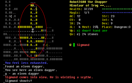
Dungeon Crawl Stone Soup in ASCII mode, with all cells within range 7 encircled. Here Sigmund is 7 steps away, but could feel a lot more menacing if he approached from the left or right. As if Sigmund wasn’t intimidating enough…
This relic of old console roguelikes is best avoided since it unnecessarily* distorts space and causes a disconnect between what we see and the actual situation. (*Unless we count nostalgia among those necessary qualities.)
The reason this convention is so prevalent is that we have the “single font” factor (and that font gives preference to text readability due to a high ratio of text content) combined with another roguelike characteristic: the grid-based display.
Grid-Based Display
Unlike most other games, as a traditionally terminal-based genre roguelikes originated in a grid environment. Though technically no longer restricted in the same way, even many newer roguelikes are played in emulated terminals that maintain the same convention to preserve that traditional look and feel (being simpler to code is another factor).
Given our single-font, grid-based display, what happens if we favor a square aspect ratio to aid tactical decision-making? This:
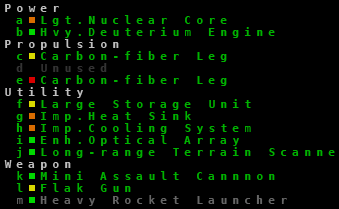
The Cogmind 7DRL/prototype used a square font to make the map easier to interpret, but the effect on the text… not so readable.
The issue is even more acute with large blocks of text, which become a chore to read as your eyes have to move 50% faster to decipher each line of text. Libtcod seems to be a major force influencing the trend in this direction, because it uses square fonts by default and is one of the primary tools for new developers. Many libtcod games use square fonts, and their text readability suffers as a result.
Words and sentences are more difficult to clearly lay out in a strict grid because some letters are naturally narrower than others. Interfaces without a grid can specify a static one or more pixels between characters, or even apply kerning (adjusting the distance between letters based on their neighbors), to resolve spacing issues.
Serifs
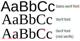
We can’t discuss fonts without mentioning the two major classifications: serif and non-serif. Serifs are short lines protruding from the ends strokes/lines that form a glyph.
In roguelikes, serifs can serve to distinguish ‘1’, ‘l’, and ‘I’, which is especially important in cases where all of these are used to represent map objects as they don’t belong to a word which can be used as a reference when interpreting them. This same consideration comes into play when selecting a monospace programming font, where you also want to make sure that ‘O’ (the letter) and ‘0’ (zero) are easy to distinguish.
In addition to their functional impact, serifs are also meaningful stylistically. Serifed fonts tend to evoke a fantasy aesthetic, though that’s not to say you can’t use serif fonts in sci-fi games. For roguelikes at least serif fonts do have the most traditional appeal, no doubt for nostalgic reasons since the IBM PC/MS-DOS console font was mostly serifed.
Fonts can say a lot about a game, though.
In general sans-serif fonts tend to suggest more sci-fi qualities: crisp, clean, streamlined. I’ll be sticking to that theme for Cogmind’s fonts, so no serifs.
Solutions
There are many solutions for addressing the readability issues discussed above.
Size
If you want a square aspect ratio but don’t want to sacrifice too much readability and don’t mind being forced into a certain style, sufficiently small wide fonts are fairly readable. Like this 8×8:
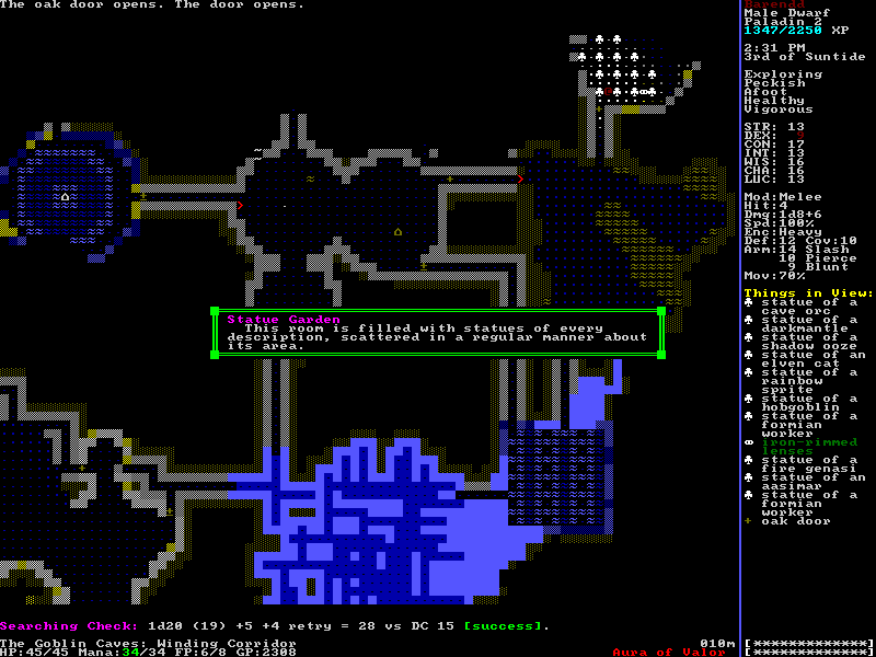
Incursion: Halls of the Goblin King, shown in a small 8×8 font (click for original size). Characters are small, but then so is the relative space between them.
Using small fonts also enables you to pack a lot of content/information into the UI, though this isn’t advisable for mouse-enabled interfaces where cell size suddenly matters for click accuracy. Fortunately roguelikes are heavy on keyboard use. Despite its many features, Cogmind is entirely playable via keyboard and/or mouse. However, if you’re on a netbook and running one of the 10×10 mini-fonts, I’d recommend sticking to the keyboard unless you don’t mind occasionally clicking the wrong target ;)
Choices
While properties that make a roguelike “readable” can be defined objectively, players’ own preferences won’t always align with that definition. More importantly, each player’s situation may differ somewhat due to factors including eyesight, available light, monitor size and quality, etc.
Roguelikes are often pretty good about offering ways to customize the experience to meet these different needs, and with such a low overhead to providing alternative game appearances (just a bitmap), it makes sense to do give players many options in that regard.
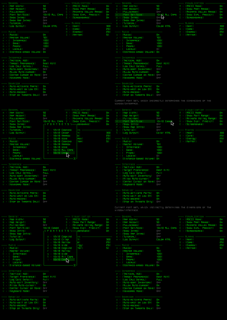
Using the options menu to swap between the two 10×10 mini-fonts I’ve been working on for Cogmind (what you see here is the text version, which is 5×10). With these, the smallest resolution/window supported by the game is 800×600.
Font switching is fairly common in terminal roguelikes, but developers can’t rely on the player to decide on the best one right away. A game’s default font ends up being quite important since a majority of players just go with the default, which becomes the font associated with the game in general (screenshots/LPs). There’s also the first impression to consider, since a font that doesn’t click with a given player can contribute to them not liking the game early on (in which case they may not get deep enough into it to want to swap in another font).
Mixed Fonts
To get the best of both worlds, a square aspect map font and narrower font for text, we have to take the radical step unavailable to standard terminal roguelikes: use multiple fonts. As mentioned in the intro, roguelike usage of fonts traditionally blurs the distinction between font and sprites/tiles. However, even if we don’t go as far as using actual sprites, by separating the two we can at least choose an ideal font for each.
Now that many roguelikes with a grid-based interface use an emulated terminal, instructing them to store font information for each cell and pull characters from one of two separate font bitmaps at render time is easy. My own engine uses the simplest implementation, which has the narrow text font take up exactly half the width of the current square font.
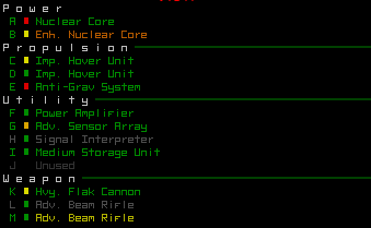
A Cogmind parts list like that seen in the earlier 7DRL/prototype image, converted from 12×12 to 6×12 half-width font. Whew.
Half-width text fonts technically double the number of horizontal cells in the interface, but allow layered UI elements to stack nicely while partially obscured lower layers can still be displayed properly. This is more compatible with the cell-stacking system of my own engine which simplifies culling, retains the traditional grid-based look, and is simple to manage since UI offsets are still handled in cells rather than pixels.
The primary drawback to this approach is the heavier CPU load from all the extra cells for the same amount of screen space. Cogmind’s display requires more processing power than the 7DRL, but it’s been two years since then, plus the cell stacking system was later optimized somewhat.
Resolution
The original roguelikes never had to worry about the player’s monitor resolution, expecting instead an 80×25 console window--fullscreen support wasn’t an issue, nor were the implications of different monitors.
Today many players like to fully utilize their screen space rather than keep a game windowed like some application. To accomplish this, unlike tile-based or 3D games that scale geometry, textures, sprites, fonts, and interface elements, roguelikes have an alternative option (or the only option before/without the use of non-console engines): swap out font bitmaps to change the resolution of the entire game to match the target resolution as closely as possible.
For most games it would be costly and time-consuming to manually recreate assets for multiple resolutions, but not so for roguelikes. All we have to do is redraw the font map, a single image, at a different size. This enables us to keep a crisp-looking pixel-perfect appearance at any resolution for which there is a font.
An example of why we don’t want to just stretch the interface:
The OpenGL version of Caves of Qud scales the entire interface rather than using an actual font renderer (compare to the earlier CoQ terminal image, which is pure awesome). While rendering fonts would be a better option, even those don’t always look good at every resolution. Working with pixels we know exactly what the result will look like, and seeing as it’s fairly easy to provide fonts for multiple resolutions, I think we should make that effort.
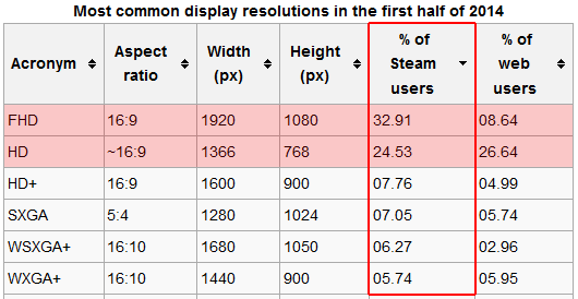
Once we decide against automated scaling, the next important question is how many resolutions do we have to realistically support? Wikipedia has aggregated some interesting and useful data on that topic:
Ranking display resolution usage by percentage of Steam users, we see that more than half are using one of either 1920×1080 or 1366×768.
Because a given resolution will not necessarily be evenly divisible by any font, in making these additional fonts we’ll need to consider some other solutions.
The simplest is to add black strips around the interface to fill extra space (a.k.a. letterboxing), though it’s best to minimize usage of this method as some will complain it’s not “true fullscreen” (however, it is important to remember in gamedev that technically someone will complain regardless of what you do…).
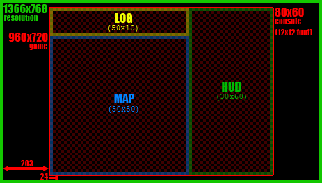
An 80×60 console GUI rendered using a 12×12 square font, the largest that will fit the entire interface within a 1366×768 resolution. This happens to be Cogmind’s UI layout, and what it would look like letterboxed at this resolution.
Ideally one or more interface elements will have adjustable dimensions, so that we can increase the amount of actual visible content as opposed to leaving portions of the screen space unused. For games where the maps are large (like Cogmind), we can increase the amount of visible map area.
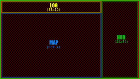
Taking the same GUI elements from above and expanding their content (no stretching) results in a 66% increase in map/log width (+33 cells), and ~8% increase in map/HUD height (+4 cells). Because the 12×12 font is not perfectly divisible into 1366, there will be 5-pixel vertical bars along each side, a small price to pay for a pixel-perfect interface.
The third font post, in which I’ll cover Cogmind fonts in more detail, will also discuss the selection of font sizes and target resolutions.
A second observation to take away from the display data: Wide screens are now the norm, thus new games should develop their GUIs accordingly. Cogmind happens to have been designed for a 4:3 aspect ratio, which are growing increasingly rare as far as fullscreen resolutions go. Of course, there are a few advantages as well: 1) takes up less space when windowed, 2) keeps information more evenly distributed, 3) requires less computing power. That said, after reviewing the state of resolutions here, on rebooting development of my other game X@COM I now plan to redesign the UI to take full advantage of wide screen support.
This is the first in a four-part series on roguelike fonts:
- Part 1: Fonts in Roguelikes
- Part 2: Font Creation
- Part 3: Cogmind Fonts
- Part 4: Readable Text Fonts for Roguelikes


8 Comments
I’ve gone the 2 font approach (more if we include dialogs). Because I’m not using an actual console, it gives me a fair bit of freedom.
My case is a little different, because my current roguelike is played over a fairly tiny 40×20 playing area. I use Deja Vu Sans Mono for the map/numbers and Deja Vu Serif (which is a variable width font) for all of the messages. I also use a smaller Deja Vu Sans Mono for descriptions and the like.
Games with the complexity of roguelikes always struggle with space for all of the necessary UI elements. My smaller playing area resulted in tiny space for messages -- hence why I concluded that two fonts would be needed. Plus, I like how it looks.
Tiny area for messages, yes, though as soon as you switch away from a grid-based environment you save quite a lot of space on narrower letters and punctuation. Ah, the luxury of rendered fonts…
Unfortunately mixing monospace and variable-width fonts like that also detracts from the classic roguelike aesthetic, crossing much further over the line between an intentional uniform interface and a full-on graphical game for which players will have higher (or just different) expectations. Of course some might argue that mixing fonts with two very different behaviors clearly delineates the map space and informational text. Personally I don’t think it has the same artistic value.
A tiny GUI does certainly limit your options (although you can compromise by using extremely simply messages)--is your plan to target mobile, then? Why such a tiny interface?
I think I will try to target mobile later, but not at the moment. I expect I’ll change the interface a bit more for that (maybe messages on maps?). The dimensions will have benefit on mobile, as 40×20 will, I think, fit reasonably well on a movile
The reason being that I wanted to try to see whether 40×20 maps would be fun to play on. They’re just that bit tighter, and (given not a huge amount of content) will hopefully speed up play a bit rather then just having bigger levels with more of the same.
So, given the small map, it didn’t seem to make much sense to have the messages being significantly longer.
I think I’m also kind of keen on it being similar dimensions to an arcade game. I figure that since I’m not doing a full screen, why take up more space then I need to?
Small maps will definitely work, especially if you design for it from the beginning. Heck, you can make a roguelike work on a 10×10 map--it’s just a matter defining the right rules and mechanics :)
The smaller the maps, though, the more likely you are to approach the puzzle end of the roguelike<->puzzle spectrum. I think that in many cases greater randomness requires more space to play out properly, as it gives the player more flexibility in terms of positioning (even if the additional freedom is often just an illusion--illusions matter in game design!).
If your goal is to possibly target mobile, the best approach is to design for that purpose from the ground up. It is, after all, a lot more involved than just map size. The ideal roguelike for each mobile and desktop will have very different characteristics. Cogmind would not work on mobile, period. Even with an adapted UI, it would end up being tedious to play and the mechanics themselves would need to be re-written, probably removing most of what makes it fun.
What about using a 2:1 tall font and then just adding space between the columns in the map display to get square cells for the fixed grid approach?
Hello I am a text.

. . . ### . .

. @ . A # . .

. . % . + . .
Thanks for suggesting another workable solution other devs might find useful! That’s definitely a simpler approach and therefore preferred for the average roguelike, and as an added bonus can even be applied to true terminal RLs as you demonstrate above with code tags.
With Cogmind’s emulated terminal, the inserted extra horizontal space would interfere with particle effects as the visual and map coordinates would no longer match up one-to-one. Forcing the in-map animations onto this kind of grid would end up looking different and reveal the underlying cell arrangement for something it doesn’t appear to be.
Another issue I can think of is this method prevents you from being able to center square font content over narrow font content. Cogmind doesn’t strictly define a “map area” and a “text/info area”--the interface is composed of many flexible layers that can each have their own font and sit on top of one another. The game doesn’t often put square fonts on top of narrow ones, but the effect is used in a few places. One example would be the large ‘X’ button in the bottom right of a console used to close it via the mouse, made larger so that it’s easier to click on. (Sure, you could also design a different button based purely on non-square fonts.)
Thank you for a very interesting post.
How about using multiple types of fonts to denote different types of enemies that happen to share the same letter (e.g. triangle wizard)?
Glad you enjoyed it!
Wow, I remember playing Triangle Wizard once a few years back but not long enough to know it does that. How… experimental of it ;)
That seems like a pretty neat idea in some cases--do you like the effect? It seems fonts would need to be fairly large for the difference to be apparent enough. It also adds yet another (arguably more subtle) method of differentiating creatures on top of the more commonly used color and upper/lower case. Roguelikes are generally about providing a dense concentration of visual information in an easy to decipher manner, while using mere font styles to differentiate creatures seems to go against that philosophy. Though I could be wrong there--just how different are these fonts?
Either way, most devs won’t need to go that far given the large number of letter/color combinations already possible. Overlap is likely since some letters are much more commonly used than others, but generally speaking 52 letters and only 8 colors is already enough for 416 creatures.
In my own case the engine expects that an entire UI element (like the map) uses a single font, so I wouldn’t be able to do something like that without some re-writing (and slowing some operations).
Thanks for adding this to the list of interesting font-related mechanics!