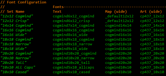
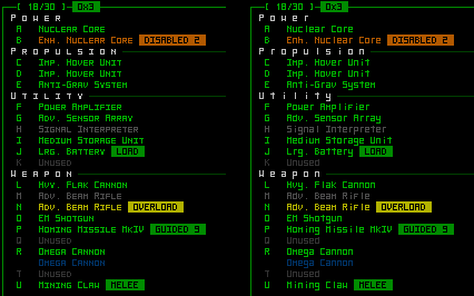
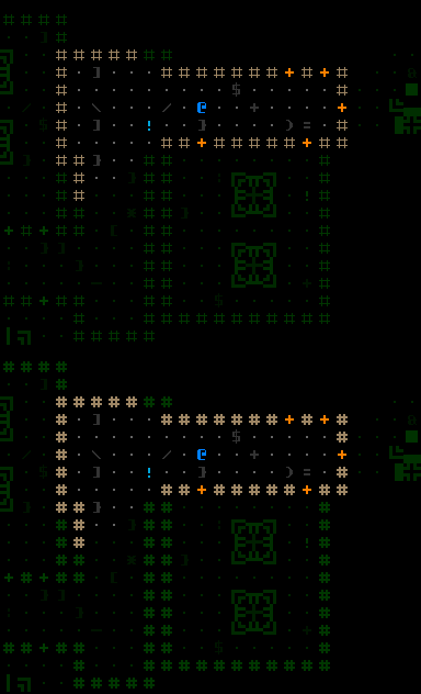
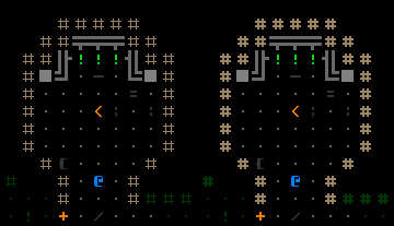
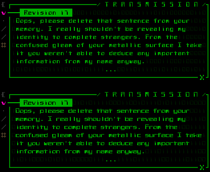
Cogmind currently comes with a whopping 26 bitmap fonts. This unusually large number is somewhat less impressive than it seems, as they are certainly not all completely unique styles, but it still took more than a week to draw, scale, and tweak them all to the point of polish sufficient for at least early releases.
Why does the game need so many fonts?
Target Resolutions
Cogmind’s GUI is designed for an 80×60 console, so to keep as close to that amount of content on screen as possible, the most appropriate font will be the one that can draw an 80×60 grid evenly onto a given screen resolution. To determine what font sizes we need, we turn to statistical data regarding the most commonly used resolutions:
Obviously if game is windowed then the whole range of font options is possible depending simply on how large a window (or what size text) the player prefers, but while running in fullscreen mode we want to minimize letterboxing (see Fonts in Roguelikes post for diagrams and discussion under header “Resolution”).
First we calculate the largest font compatible with a given resolution. Height will be the limiting factor because Cogmind uses a 4:3 aspect ratio while most screens are 16:9/10. Any remaining space is then filled by expanding the map view, which defaults to 50×50 cells but can show more if there’s room. Most fonts still result in a tiny bit of letterboxing in one dimension, but it’s a pretty insignificant amount since our grid cells are quite small, and well worth the pixel perfect appearance. Note that we could get closer to our target resolutions by using odd-dimension fonts (specifically a 15×15 font could perfectly match the common 1600×900 resolution’s height), but that would make it more difficult to keep different-sized fonts proportional to one another.
Thus from the list above we can see that the optimal font for a majority of players will be either 12×12 (25%), 14×14 (14%), 16×16 (13%), or 18×18 (33%). In addition to those, Cogmind adds another two sizes useful for special cases:
- 10×10 “mini-fonts” for netbooks with tiny screens (minimum resolution: 800×600). Cells that small can be tough to accurately click on, but are not too small to see (if you’re already using a netbook…) and work just as well with keyboard-only play.
- 20×20 “mega-fonts” for huge screens (like my own 1920×1200). These are required for recording videos, so useful for myself and LP’ers. YouTube compression is notoriously horrible for processing small pixel-perfect ASCII, so the key is to record at high resolution with thicker lines to retain as much information as possible. At least that’s the theory--I haven’t tested it yet. Cogmind’s animated gifs always look good down to the yummy pixel level, but for full immersion we need sound!
In total we have 6 different font sizes to support. Why do we want to draw fonts for all these resolutions instead of just scaling the window? Because scaling looks awful! (The other option discussed in the previous post is TrueType fonts, but they still don’t offer pixel-accurate control.)
Font Categories
For each font size, we need at least one separate bitmap for each of three different purposes.
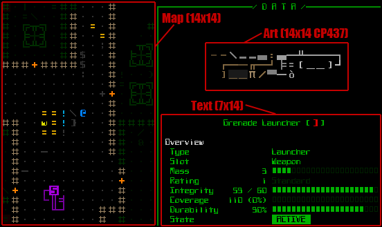
A screenshot excerpt of the game running in 14×14 mode, showing all three font types in the same interface--the map, text, and art.
Map
The font used to display the map has a square aspect ratio to preserve uniform distribution of space for better tactical decision-making. In the future players will be able to optionally replace these fonts with (simple) sprites/tiles at the press of a button, but the sprites have not yet been added.
Text
Text fonts are half as wide as their respective map fonts, giving them a somewhat restrictive height-width ratio of 2:1 rather than more common ones like 8:14 or 10:16. This makes designing good fonts a bit more difficult, but the tile engine is optimized assuming font widths use multiples of a single value, so other ratios are out of the question.
Art
As discussed earlier (see here and here), Cogmind art is created purely from code page 437 glyphs. Unlike some other roguelikes, Cogmind map and text fonts do not need the entire 255 character range of CP437, instead sticking to standard alphanumerics and punctuation. This at least keeps the total number of required glyphs down from an otherwise ridiculously huge number, but we still need to draw the full character range for art font bitmaps, and need one CP437 art font for every supported font size.
Though map and text fonts use sans-serif styles, I decided to use mostly serifed fonts for CP437 to retain the traditional feel of individual glyphs. They have, however, been converted to a square format to make art creation a little easier and enable balanced symmetry in both dimensions.
Creating an art font is more time-consuming than a map or text font not only due to the greater number of glyphs, but because every different size must do its best to maintain the same proportions. This way pieces of art drawn at a given size (I draw at 12×12), will look more or less the same at all other sizes. (By comparison, map and text font styles should look similar at different sizes, but are not required to have the same proportions and can focus instead on readability, which is much more important in those cases.)
Making sure this effect will work requires a lot of cross-comparison when drawing the fonts. Sometimes compromises are necessary due to space concerns, or whether there is an odd or even number of pixels available in a given area, etc. There’s still (always…) room for improvement, but enough time has been put into polish already.
At this point I’ve completed REXPaint‘s library of square-ratio CP437 fonts. That tool’s next release (1.0) will include everything from 8×8 to 20×20.
Player Choice
Another reason for the many fonts is that some styles have variants which may be more readable for some players. This applies only to text, for which readability is more of a concern (map and art fonts on the other hand only have a single option at each size). Each size usually has a couple variant styles to choose from.
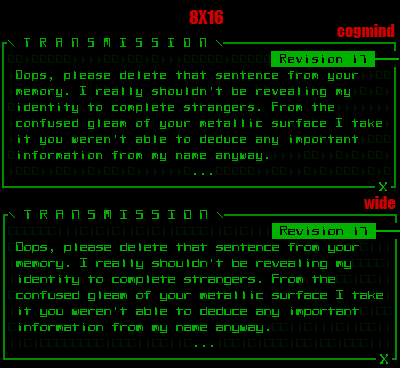
Comparing two 8×16 variants: “cogmind” (top) and “wide” (bottom). This is a dialogue segment from Revision 17, a not-entirely-sane robot who gives you a tiny bit of background at the beginning.
With multiple fonts available it’s easy to change the style, and therefore appearance of much of the game overall, via the options menu:
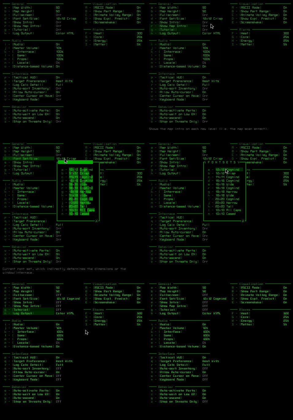
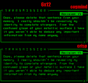
Swapping between two 6×12 fonts, the “crisp” style I’ve been using in all screenshots before now, and the newly-added “cogmind” style.
It’s also easy to add new fonts to the game--just draw a bitmap for one or more of the font categories and add it to the fonts/config.xt file:
Notes on Style
Keeping a thematic style is tough to do at small sizes, since every pixel becomes valuable in terms of readability, a property we can’t sacrifice in the name of style, at least not for a roguelike where reading text should be mostly effortless to avoid slowing down gameplay. I did recreate the cogmind style at 5×10, but it’s not very readable and won’t be included with the game:
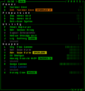
An unused cogmind-styled font at 5×10. It looks interesting, but the high pixel density hurts readability.
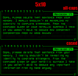
Instead there are two other 5×10 fonts that focus purely on readability:
There were also symmetry issues designing mid-sized map fonts (16×16). For example, 12×12/14×14 fonts use 2-width ASCII lines, and the next size up should logically use 3-width lines, but you can’t center a value of 3 given an even dimension. As an experiment I tried to skip to 4-width lines to keep them centered in their cells, but the relative proportions are noticeably different, causing machines to appear not quite how they were intended. After some testing the best solution was to draw 3-width lines 1px off center (only a couple of fringe case machines look a bit off, as opposed to all machines).
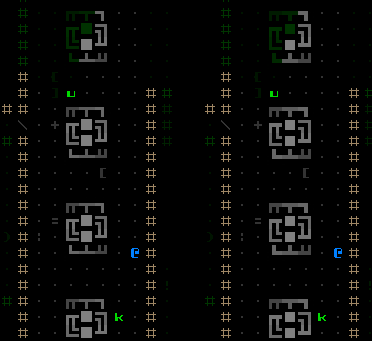
16×16 map font tests, demonstrating how thinner off-center lines (left) better reflect the original machine design than thicker centered lines (right).
Looking closely at the earlier 5×10 text fonts you’ll notice that both line glyphs as well as vertical strokes in certain letters are actually off-center as well. They have only 4 pixels of width for drawing (one is reserved for embedded spacing), and attempting to give them perfect symmetry by doubling the width/height of those lines stands out too much and unbalances the font’s overall appearance.
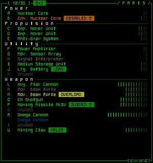
Too much attention is drawn to the ‘I’s and ‘T’s etc. when trying to design for symmetry at this small a size, throwing off the balance.
Another stylistic consideration for roguelikes in particular is that certain characters can have disproportionately greater impact on the game’s appearance. Last time I talked about use of the period for empty spaces, and showed how a couple extra pixels on that one glyph can drastically change the appearance of the entire map. Similarly, the hash (‘#’) symbol is going to be pretty ubiquitous for any roguelike using it to depict walls, and thus deserves extra attention. Again as a transitional font size the 16×16 map font had to decide between a thin and thick version.
The 2-pixel version produces a much higher contrast between open and closed space, but also draws a lot of attention to walls as a character when we care much more about other characters representing interactive objects and entities. Later maps painted with brighter wall colors would suffer even more in this regard (no, we’re not setting different object brightness values for different sizes, thus colors that work at one size should ideally work at all sizes).
One aspect I like about thicker hashes is that they better mesh with wall-integrated machines:
However, this is less important overall so we’re going with the thin style (until at some future date I disagree with my current self).
Text Font Comparison
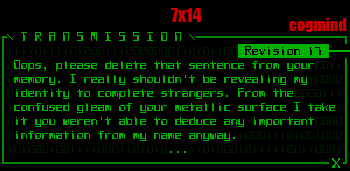
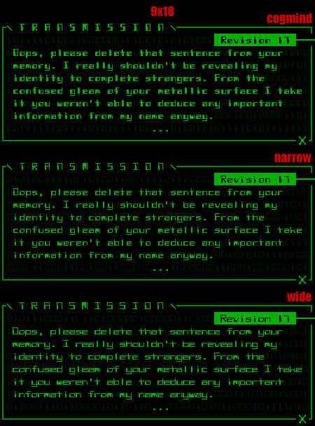
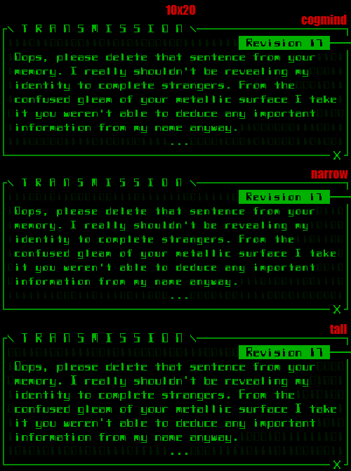
Below are all the text font options available for each cell size, all demonstrated using the same dialogue window. Feel free to share opinions on style, readability, or whatever. I’m interested in knowing what sizes and variants are preferred (or not preferred), as this can affect what fonts I tend to use for screenshots and gifs. The game’s default font(s) are also fairly important since many players will probably not immediately realize that switching fonts is so easy and that there are so many options (after all, customizable text is not very common outside of traditional roguelikes).
5×10
6×12
7×14
7×14
I’ve only drawn one font for 7×14 (this particular size was originally going to be left out, until a review of resolution stats showed it could be required by 1 out of 7 players!).
8×16
9×18
As we get larger, there is more room for variety in style.
10×20
Regardless of which sizes look better, I’ll definitely be using 20×20 to record videos since it should be best able to survive compression. Screenshots and gifs will use smaller fonts to fit more content at their native resolution and avoid shrinking.
More Options
Most of the text fonts are currently derived from a single style, attempting to take it in multiple directions and explore the potential for readability at different sizes. Depending on the results--the overall feel is certainly different when experienced in game interacting with the full UI--I may add more fonts with completely different styles that focus purely on readability. Already some good suggestions have come in from readers, including this.
Update 150113: Since this post was first published, a 12×24/24×24 font has also been added to support 1440p displays!
Update 150510: Added support for super-sized fonts on screens up to 4K.
This is the third in a four-part series on roguelike fonts:
- Part 1: Fonts in Roguelikes
- Part 2: Font Creation
- Part 3: Cogmind Fonts
- Part 4: Readable Text Fonts for Roguelikes


