Traditional roguelikes are both at an advantage and disadvantage when it comes to accommodating color blind players. On the one hand recoloring monochrome glyphs is a fairly straightforward process; on the other a game lacking any method of adjusting colors can be difficult for some to play, more so than say a game with unique multicolored sprites for each object.
A good number of roguelikes store data in external files, so technically it’s possible for players to dig through the data and make changes to improve their experience. This is far from “accommodating,” nor is it very realistic to expect every player that needs it to be willing and able to do this. There must be better solutions.
But first, a closer look at the issue for those of us with normal vision.
Color Blindness
Color blindness mostly affects the male population, anywhere from 5-10% of it in fact, so it’s definitely an issue to take into consideration. Even before reaching out to a broader audience with Cogmind I’ve already been contacted by multiple players with color blindness who hope the game can accommodate them.
There are many forms of color blindness, some rarer than others. Here we’ll look at the most common one, deuteranomaly (approx. 6% of males) and its more extreme form deuteranopia (1%).
There are various programs and websites that enable people with normal vision to simulate various types of color impairment. The best I’ve found for desktop use is Color Oracle. It only simulates the most extreme versions of color-blindness, with the understanding that designing for extreme deficiency will naturally improve the experience even more for everyone with less extreme types.
The web-based solution I actually used because it provides more options is here. If you have a game/project of your own I highly recommend testing out some screenshots to get an idea what this portion of the population sees when viewing it.
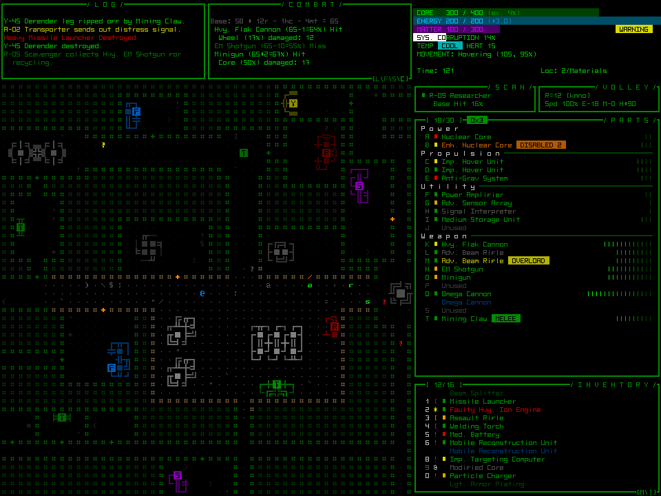
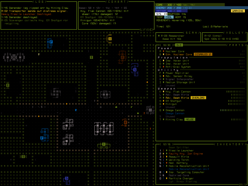
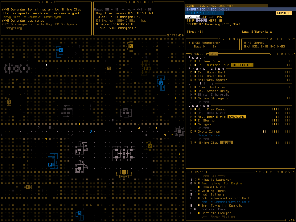
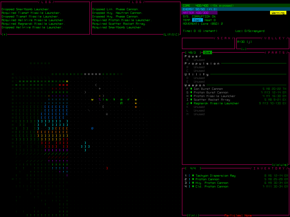
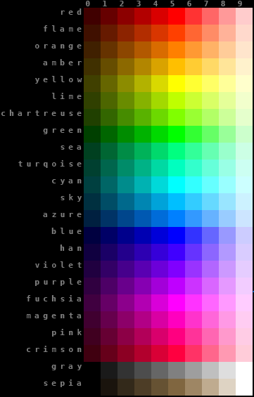
Let’s take a look at the old Cogmind mockup because it contains many elements in a single image.
While the second image appears much more muted than the original, especially given that terminal green is the Cogmind’s color theme, it’s still pretty playable. The biggest problem I can see there is that red no longer shouts “problem here!”
The third image, lacking any green whatsoever, would be much more problematic, though any solutions that work for one will work for the other.
Specifically which parts of Cogmind might need more attention in terms of adaptable color? Log messages would be an obvious one. Any important warning indicators would also need to be checked for how obvious they are…
The previous post about particle effects in Cogmind also discussed color themes used for particle effects. These are actually of little consequence and being able to identify them will have no impact on one’s ability to play the game. Consistency was the goal when assigning colors.
In game you won’t be frequently meeting lots of new types of enemies with different weapon effects distinguishable only by color--shape and style hold the most useful information, since all you need to concern yourself with is whether you’re being shot at by ballistic, thermal, or electromagnetic weapons, all of which have very different styles. With regard to color reflecting a weapon’s power, as you advance through the world enemy robots naturally use stronger weapon variants anyway.
A much bigger issue is the color of enemy robots themselves. Primary robot classes identify their variants from weak to powerful using a spectrum of color, therefore ensuring those colors are distinct is of utmost importance.
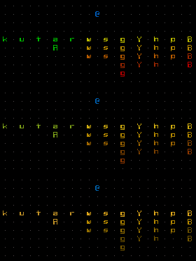
Robots from the Cogmind prototype, as seen by normal vision, green-weak deuteranomaly, and green-blind deuteranopia.
Fortunately the color scheme is fairly simple and therefore should be easy to modify when necessary using one or more solutions.
Solutions
While Cogmind can’t be accessible to absolutely everyone, it’s nice to be inclusive where possible. UI design principles emphasize that all information should presented in multiple ways, at least one of which that does not rely on color at all. It’s not always possible to both achieve this ideal and maintain a specific aesthetic, but I try.
In the case of Cogmind I am not allowing consideration of color blind players to affect or inform the overall design, but do intend to implement workarounds based on feedback from actual players when the time comes. Ideally the solution should be easy for both players and developer, and fortunately Cogmind is backed by a flexible data-driven system that simplifies the process. Here are some of the possibilities:
Message Logs
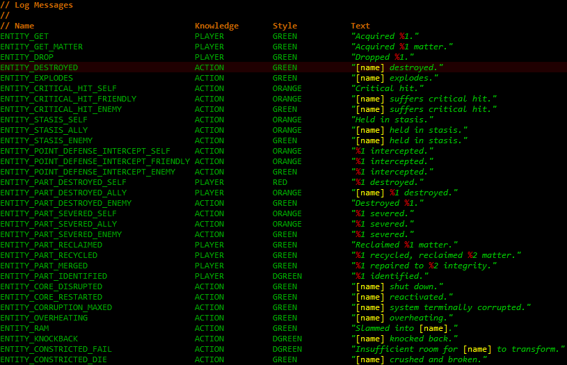
Message logs should always be colored to speed up visual parsing and make important messages draw more attention. Colors for individual messages are set in an external file located surprisingly in the “data/messages/” directory.
That may give you highly specific control, but setting colors for more than a hundred messages while keeping them consistent isn’t exactly fun or easy. It’s less of a hassle to just change the underlying styles defined in a separate file:
“GREEN” is obviously for good things, “RED” for bad, etc., thus you could change the color for any of them by using an alternate abbreviation. The color abbreviation system used for internal particle names is pretty easy to follow--first two letters of the base hue followed by 0~5 for fully-saturated colors of varying brightness or 6~9 for desaturated bright colors. (Incidentally you can also use this file to change message drawing to use a completely different animation rather than just changing the color.)
Non-log-based temporary popup messages use the same system, defining only two styles “CONFIRM” and “WARNING,” colored green and red, respectively, that some players may prefer to switch to different colors.
Animation/Interface
Cogmind’s animation scripting engine includes support for global constant variables, which have already been implemented for much of the GUI. What this means is that by changing a single value or handful of values you can modify the appearance of large parts of the interface without messing with any scripting details. These values are all conveniently located in one place, enabling centralized control of this customization feature.
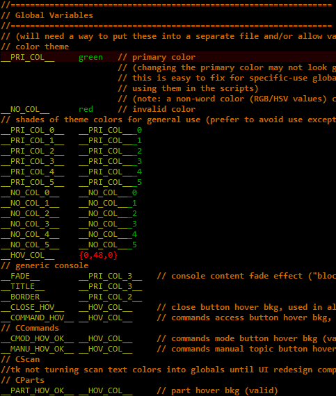
Global variables in scripts, a work in progress since it makes more sense to finish them off once the animations are finalized. This isn’t meant to be a user-friendly list at this point, just something for my own reference.
I’ll even prove it works! ;)
An Ultimate Solution?
We could take this even further and create a filter loaded by the engine that converts the entire color palette regardless of what the game gives it. Defining such a filter is far easier than it might sound, because while the interface may look colorful, the engine and game use a limited set of named colors.
All the engine uses is a short list of hue values, generating the rest automatically--even the multicolored ASCII animations are created on the fly by interpolation and alpha adjustments defined by scripted parameters.
I haven’t implemented the filter feature, but it would be easy to do. You could do something as simple as change a single value to turn the “red” line to some new blue, or go so far as to redefine every single color, which is still only 21 values. With a different red value, everywhere in the game that any “red” color is used would automatically use the preset blue replacement instead, with ZERO processing overhead (always a nice bonus).
It would be even more interesting if the palette could be swapped by using an external image file rather than text. As is, a mathematically generated palette means the simplest solution describes color hue by number.
For the GUI this is good news, but for the map I’d say that because Cogmind does a pretty good job of using the entire palette*, it won’t be easy to redefine object colors without creating informational overlap.
*By hue, not brightness--Cogmind actually only uses about 20 different colors on the map, and 50% of the colors you see in that generated palette aren’t used in the game at all! (It is a generated palette, after all.)
Additional solutions could be made available depending on player demand.
Overall the problem is complex enough that it won’t have an easy in-game solution--some file editing will be required, but it shouldn’t be too difficult. And I’d of course be happy to host pre-modified files for download, even better if they’re made by the community itself!
Update: Several years after this post, Cogmind added various Color Customization features as well as a colorblind mode accessible directly in the Options menu!
