Having recently finished adding 600 pieces of ASCII art to Cogmind, now’s the best time to write a bit about the process used to draw it all. (Read the previous post for a bit more background on ASCII art.)
First a disclaimer: I’ve only been drawing ASCII art off and on for about a year, so I’m not exactly an authoritative source on the subject, but in that time I have developed an interesting style that’s earned a good bit of positive feedback. Here’s how it’s done.
Form
Starting with the basic form is what you do in pretty much any drawing medium, but with ASCII it’s especially important because the “flow” of an image can be difficult to capture (though it is by far its most important aspect). After all, you’re drawing with a predefined set of glyphs!

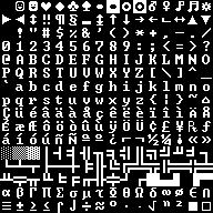
The code page 437 glyphs used to draw Cogmind art.
The limits force you to get creative when considering how to depict and connect various features. You have to think just as much about what isn’t there as what is, since the viewer’s imagination is instrumental in connecting the dots and filling in empty space. Ideally you’ll want to look at the same piece multiple times split up by periods of waiting to make sure you weren’t getting too used to looking at it a certain way--it may appear different (either worse or better) when viewed fresh.
While 255 characters is quite a lot, a smaller subset sees more use than the rest. An image can’t be a jumble of characters, since the eyes need a clear way to trace the picture by following lines or line-like characters (it’s good to remember here that a viewer will tend to imagine extensions of existing lines where convenient--always think about how “suggestive” a character is in a given position).
Alphanumerics should be used sparingly or for emphasis/special purposes, as they are too recognizable as an individual unit and tend to feel somewhat detached from other glyphs.

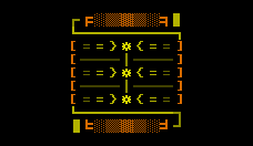
A Gauss Cannon concept. I tend to use a lot of lines, which sometimes feels like cheating, but still retains that distinct ASCII look.
Another concept to consider at this stage is the “weight” of a given area, determined by the number of pixels that make up the glyphs used there. A concentration of dense glyphs will naturally lend more weight to that part, thus even where a glyph’s shape seems perfect for a certain use, if its thickness isn’t suitable then you may have to find another way to achieve that particular representation.
As shown above I work in grayscale for this entire step of the process, since we don’t want to be distracted by color. Color will be important, and naturally even affects the flow and weight of an existing design, but for me it’s better to readjust those later rather than working with too many variables to begin with.
At one point early on I was considering the feasibility of generating this style of ASCII art procedurally, but the flow and weight won’t look as consistent compared to manually placed glyphs.
Shading
The next step is to vary the brightness of individual glyphs as necessary to redistribute the “weight” discussed in the previous section. A piece full of lines/characters with uniform brightness can be hard to decipher. Key glyphs may be highlighted where appropriate, and both interior and exterior details are darkened so they still contribute to the overall image but don’t interfere with the “flow” of the main shape. This is also where background blocks can come into play, though for this particular style I use them only sparingly, and generally keep them dark.

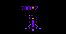
Pipes/wires going “behind” others are usually faded, as are those that trail off (the effect is more pronounced once color is added). This is a Power Amplifier utility, by the way.
Probably the most common shading trick I use is simple gradients, since those work well to give an image volume.
This entire step can still be done in grayscale, though may end up requiring tweaks depending on the colors used later (for example, violet gradients may need a greater step to achieve a purposefully noticeable gradient effect).
Color
As [my] ASCII art is mostly about shape, I don’t have to (or want to) use too many colors, at least not in a single piece. Small images generally use just one color, and only the largest might use three; a vast majority of the art uses two colors, one as the primary color and another often brighter or complementary color for highlighting.
In keeping with the terminal interface theme, pretty much all colors are fully saturated and often also very bright. You don’t have to stare at them for long periods, and there’s only ever one showing at a time, otherwise I’d tone it down like the rest of the interface which generally hovers around 70% brightness.

A Neutrino Core. One won’t make your eyes bleed, but I stared at screens covered with hundreds of these for hours and hours while drawing them all =p
While there is not a lot of color mixing, quite a few colors are used throughout the entire collection. Colors are internally consistent where it makes sense, hence there are a several common sense themes like orange/red for anything associated with fire/plasma. That said, the art isn’t required for item identification so in a lot of cases I just use fun wild colors, sometimes in an attempt to keep better items looking “cooler.” No I will not show any cool items here. They shall remain secret until you find them in game. ;)
Time Lapse
Normally I do entire item types together as a group for each phase, meaning sketch all weapons, then color all weapons, etc., though below you can see all the processes as applied to a single item from back when I was working on initial concepts.
I wasn’t going to show any “really cool” items, but I already gave you the grayscale Neutron Missile Launcher sketch, which once colored is one of my favorites (though it’s only a mid-game weapon). So, here is a sped up time lapse of the process used to draw and paint that one:
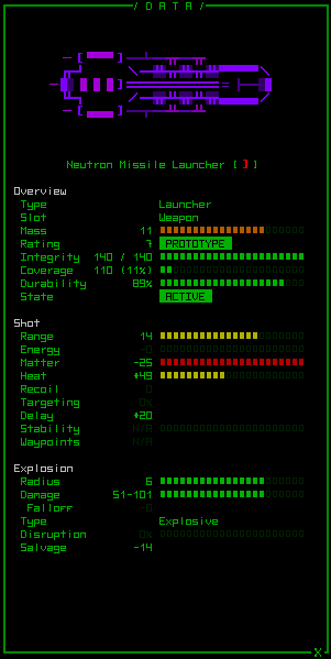
And the final product, colored and in game:
Addendum
[Update in response to a forum question.] Anyone familiar with traditional ASCII art will know that much of it uses a lot of background colors/blocks, making it almost like low-res pixel art. On the contrary most of my art avoids background colors, which is a conscious decision on my part. I’ve found that it’s a lot easier to be more expressive in a smaller area using primarily line art and glyphs. Background colors result in far too many square corners that impact the flow of an image, and unless very dark they also tend to cause a strong weighting towards an area, limiting their use even further. A lot of my earlier concepts played with the idea of using more background colors, but I stopped adding them almost entirely later on. The majority of final art pieces that do contain them are larger and thus more easily “contain” a full square of color. Sometimes I’ve also used them to accent the second half of a half-block foreground glyph.
REXPaint
All of this was done using a tool I developed specifically for this purpose, one freely available for use in your own projects: Check it out. Of course the methods described above are for a very specific style I’ve developed, when there’s really a lot more you can do with REXPaint and ASCII art. Stop by the REXPaint gallery to see examples of styles by other artists. Also see this post for a guide covering REXPaint’s many potential uses in roguelike development (mockups, art, prefabs, etc.).


6 Comments
Yay! Thanks for this post, I actually wondered how was your ascii making workflow and the GIFs really help showing up the process :)
No problem, I’ve gotten some questions about it before and am always looking for topics to post about, so here it is! There really are a lot of potential styles out there, though--I just played around with it until I found one that I liked and could take pretty far.
Hello,
Your ASCII art looks great! So do you have an art background or is ASCII art something you picked up?
Thanks! There’s a disclaimer in the second paragraph that addresses the ASCII part of that. As for the general art part, only as a hobbyist.
As a kid I used to draw a lot and enjoyed visual creative projects, and once in college and beyond I spent a fair amount of time playing around with digital art. Never anything really amazing, but I’ve at least been at it for a while (over 20 years of Photoshop use :P).
My photography is far better than my art, but there’s always some crossover when it comes to examining balance. One thing I’m decided not good at is color, which is one reason I really welcome Cogmind’s simple style.
So you could say I have a useful background, but not with ASCII specifically. I think one of the cool things about ASCII is that it’s much quicker to get results through trial-and-error (as opposed to pixel art etc.). Wasteful in terms of time, yes, but at least I can do it xD
Wow!!! I was using rexpaint earlier this week, and I really like it..but I had no idea you were making such amazing game art!!
I am working on trying to bring MUDs to the browser in a new and modern fashion. I’ve been having lots of struggles trying to get CP437 characters to render in a browser. Well, actually, they’re being send through a terminal / websock connection to a browser. I was wondering if you had any suggestions on how I could best get art from rexpaint to render properly in a terminal first. (using item2) I know it’s difficult for you to know exactly where I’m at, so giving advice is probably really hard. Maybe any directions you could point me would be appreciated. Anyway, don’t fret it! I’m definitely going to be poring over your stuff. Fucking way to go on pushing things to a whole new level!!! It’s pretty amazing.
Hi Jared, thanks! Glad I’ve been in a position to push a lot of boundaries these years :D
To be honest I am totally not a web dev, but I do know where you can get some answers! There are a bunch of roguelike devs who work with getting terminal graphics onto the web (including work they do in REXPaint!), and you can find them/us on r/RoguelikeDev.
Before posting about your goals and questions there, though, you might want to try the Discord a few times (when different devs show up throughout the day), since you can get some back-and-forth going there more quickly, and there are a good number of web-based RL devs who frequent the #roguelikedev and #roguelikedev-help channels.
As is I’m a bad source for anything web-related, but in terms of aesthetics, UX, design and that sort of thing you’ll probably find plenty of useful resources on the blog :)