Continuing on the concept touched upon in the previous post about message logs in roguelikes, shifting the player’s attention from log to map works in tandem with making more information available directly on that map. I like to summarize this kind of feature with the phrase “map dynamics” (from a UI perspective, not map layout), referring to animated visual aspects of the map that provide supplementary information such as various types of overlays and labels.
The simplest example already in use would be the highlighted line-of-fire projected from the origin when selecting a target. It shows the intended path of the projectile in a shade of either green or red depending on whether that path is clear of obstructions. (This line-of-fire preview can also be activated separately without using an actual weapon to target.)
Ally order visualization, a feature covered in an earlier post, also falls into this category. Here we’ll look at all the new map dynamics features.
Path Preview
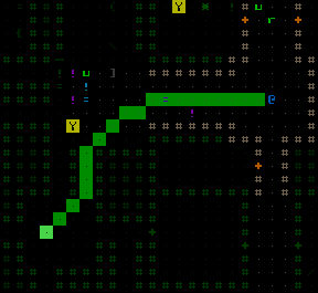
Mouse users can hold Ctrl-Alt to preview the path that will be taken to reach a given destination by simply clicking it.

Sometimes the path will be updated while on the way to the destination if a more efficient one is found, though it won’t deviate too much from the original.
Volley Range Visualization
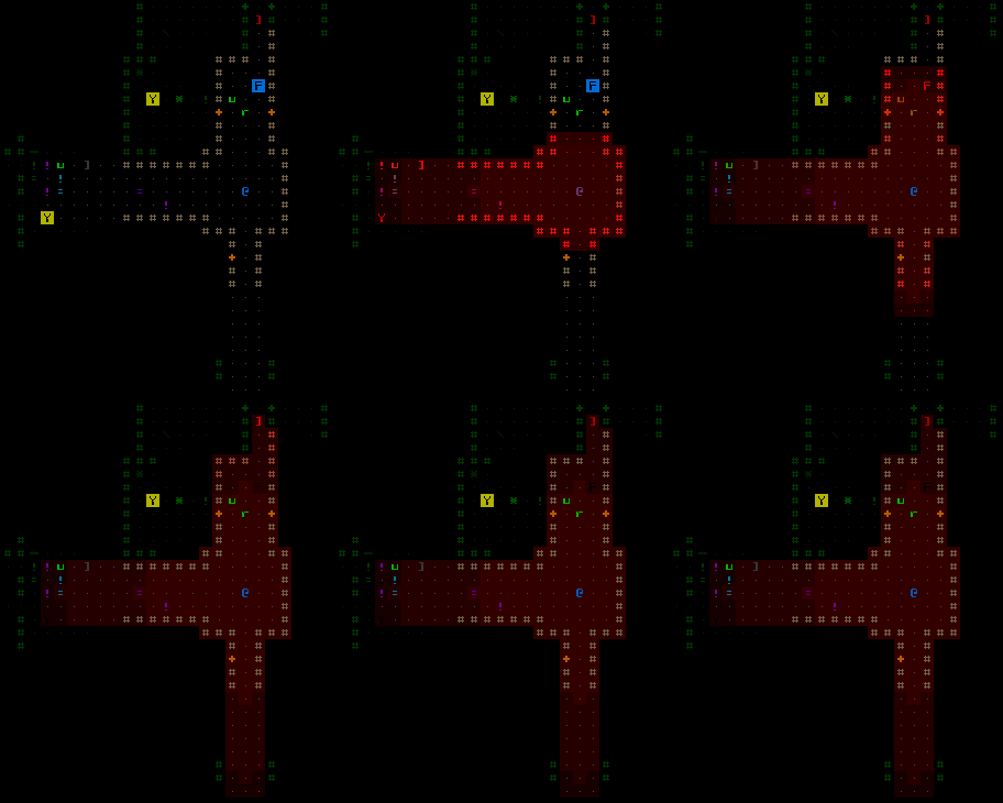
Activating the range visualization overlay simultaneously highlights all parts of the map within view that any currently active weapon can reach, using a brighter color for areas targetable by more weapons (i.e. areas of overlap). Thus a varied volley of weapons will generally result in closer areas being brighter as only a subset of the weapons reach the maximum range.

The animation is optional--range visualization mode can be configured to appear instantly if desired.
Weapon Radius
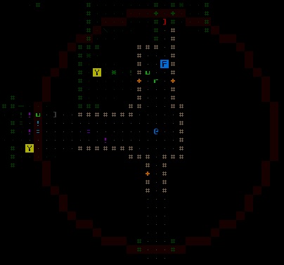
Hovering the cursor over a weapon in the parts list causes a faint pulsating circle to appear on the map, centered on Cogmind’s location (which is always the center of the map view, unless you’ve temporarily shifted it elsewhere). This circle is the radius within which that weapon remains effective. The weapon radius feature is mostly intended as a quick way to compare weapon ranges when activating/deactivating them, just as a reminder; seeing what specific locations can be hit is better handled by activating the volley range visualization.
Explosion Prediction
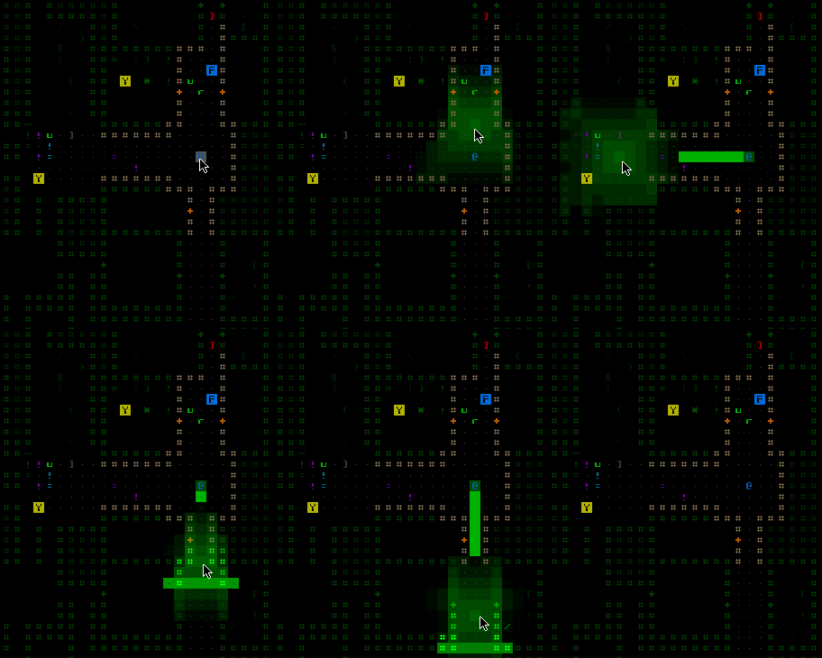
Rather than forcing the player to check explosion sizes and count squares, targeting with any explosive weapon automatically shows a prediction of the average area of effect around the target location, taking into account both the explosion’s falloff rate and terrain dampening (a given explosion won’t blast as far through cave walls as it will through a door). Know that only an approximation can be shown because damage--and therefore radius--can vary (more so with certain types of explosions), thus the average value is used for prediction calculation purposes, with the actual AOE being somewhat smaller or larger in each case. (In reality it would look like a slightly spiky ball projected from the origin.)
More
We’ll continue to expand the map dynamics system with new overlays and functions as appropriate. Before long there will be a map object labeling feature similar to that seen in X@COM, allowing you to quickly see names of all parts and robots in view. Eventually there might be a map region overlay as well--that depends on the final type of map generator, which currently exists in generic form but has yet to be integrated into the game (current testing relies on the old prototype map generator).


4 Comments
I really like your project, the animations and visualizations are a really nice touch. I think it’s great to get the focus away from message logs and give the map more meaningful feedback. Roguelikes can feel quite impenetrable to a new player so making them easier to digest is a good choice.
Thanks, anything to improve familiarity with what is an otherwise relatively esoteric medium ;) Many of the features I’m adding are common to non-roguelike games, but no one bothers to implement them despite how useful they can be.
This looks fantastic! I was looking for games in visual style of Brogue when I found this; this looks like it might be even better. Can’t wait to play it.
Thanks! Always honored to hear the comparison.
It’s difficult to compete with Brogue in terms of screenshots because that game is so colorful, while I’m purposefully not using background colors so they can be reserved for animations and important situational information. The environment is pretty barren, but that’s because the gameplay and visual design focuses almost entirely on the occupants of the world, which is where all the action’s at. The unique look only becomes more apparent in gifs and (in the future) videos where you can see the game in motion.