I recently entered “tired of seeing notes about future tasks that could easily be done now” mode, wherein every few weeks I attack all those little comments that have piled up here and there while working on bigger features (most recently hacking).
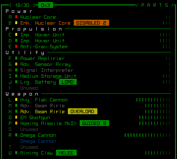
One result was the addition of new visualization modes for data about your attached parts. Recall the original GUI mockup showed what was the only such visualization implemented before now: relative coverage.
Now you can quickly and easily compare parts based on several different criteria by changing the mode.
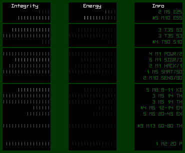
Integrity mode is pretty straightforward, giving you a more accurate and obvious visual representation of a part’s remaining integrity. Energy mode shows the power generation or consumption for a part, with generation shown in cyan and consumption shown in blue (gray is for deactivated parts). Info mode prints type-specific vital stats, the meanings of which will become apparent very quickly while playing (these are the same abbreviated stat strings shown in the remote scan window)--for example, the first category (power sources) show the source’s rating followed by its mass (M) and energy output (E).
Mode cycling is controlled by key commands or buttons that now appear at the bottom right of the parts console. Visualizations are also shown for parts listed in the inventory console.


