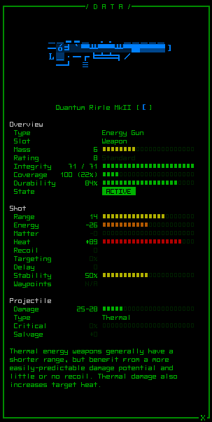
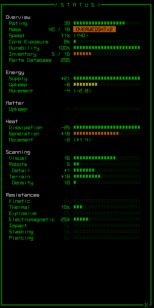
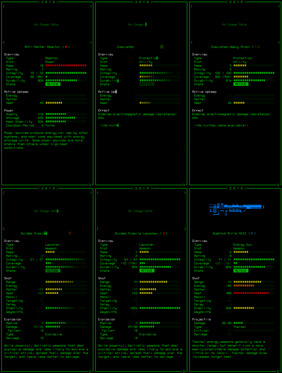
The info windows have been overhauled and are now even more informative than before, made possible by smaller fonts.
Before they were just walls of text and numbers, while now we have color-coded labels and bars to help quickly weigh the advantages and drawbacks of whatever you’re examining without being forced to interpret a bunch of numbers, though the numbers are there for cases where you want to know the specifics.
As you can see I added support for ASCII art, though it will be a daunting task to draw every item in the game. Also, since I’m working with old placeholder objects the descriptions have yet to be written, so in all screenshots the text seen at the bottom is just copied from elsewhere/old data.
Colors reflecting percentages have a uniform meaning throughout the interface, equally dividing green, yellow, orange, red into quarter percentiles. (This will be important later on with the hacking interface, as I’ve designed the concept mockup, anyway.) In cases where it makes sense, though, you’ll notice bar colors are reversed when high values are bad (e.g. heat).
Info windows can be displayed for items, Cogmind, and other robots.
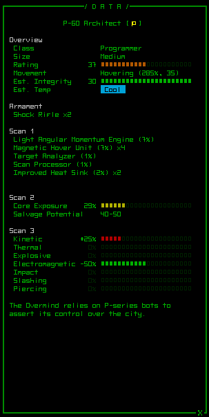
With an advanced scan processor you can discover important details about your enemies, like this programmer-class bot.
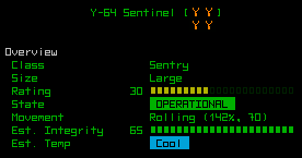
Multi-tile robots are indicated as such with their icon, so even in ASCII mode you’ll know it’s a single large robot and not a group of many smaller robots (though letters will never be reused like that).
All windows are, of course, animated:
Next: Integrating the manual with the game through context help.
