The GUI is getting a makeover with new animations
While the 7DRL had animated window borders, text printing, and button hover highlighting, all were just simple features copied over from the original source at the time (X@COM). Nonetheless, it was definitely a feature that had players going “wow” from the start, so we need more of that.
I’ve done a comprehensive review of all previously static parts of the interface looking for new areas to animate, and updated old animations to fit with the new style. All sound effects were also replaced with better versions, with new ones added where appropriate
Probably the most static part of the interface that needed to show some appropriate activity during startup was the HUD’s upper-right status info:
Special Effects
While the animations described above are merely eye candy, I took the opportunity to also add special effects for visual reinforcement of important Cogmind-related status events. These are both informative and aid immersion (remember, you are the Cogmind!).
When the core is low on integrity, all right HUD window borders will glow red, and if overheating to dangerous levels they glow orange. I’m not too happy with the appearance of the glow effect, but it’ll do for now.
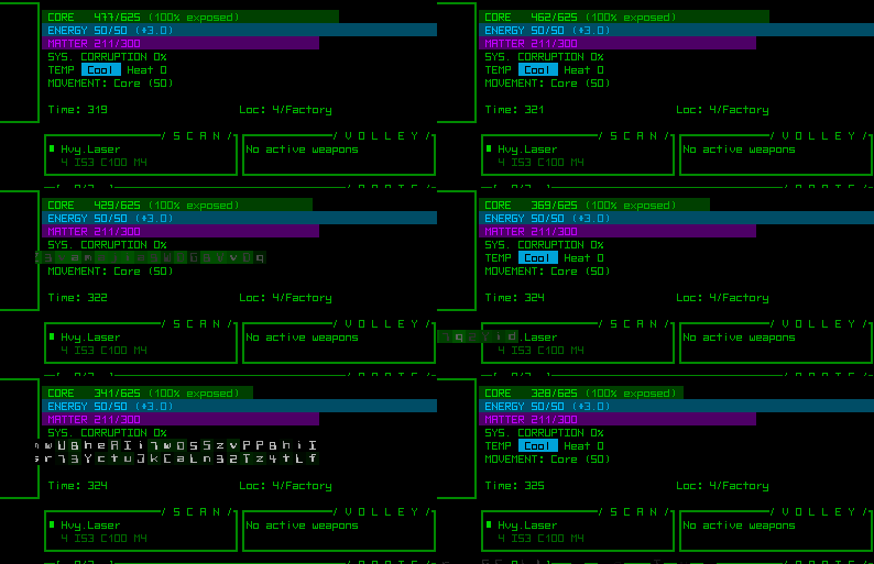
The other two effects are far more effective: Garbled data is displayed whenever the core takes a direct, where the greater the damage the larger the effect’s area; and system corruption intermittently causes glitches across the interface, with frequency and amount based on the current level of corruption. These effects aren’t annoying--just enough to tell/remind you what’s going on, but there will be an option to turn them off if you like.

Cogmind just sits around naked taking a beating so I can record the effects in one corner of the screen.
These help address one issue in the 7DRL whereby it could be easy to forget/overlook your dangerously low core integrity until it was too late, that and you could easily overheat without noticing (later 7DRL fixes added messages and the occasional alarm/warning sound, but it’s always nicer to communicate your condition in an another direct and obvious manner).
Showing when the core itself takes damage will also help draw attention to the amount of coverage your current build has.
There’s still plenty more to do with the GUI. The original status and info windows haven’t been touched because their content will be changing before they’re completely redesigned, and there will be several new windows coming to support new features, but it’s about time to get back to expanding the game logic itself.


8 Comments
I think it would be nice if you added a sort of red or white flash and quick fade out for the sections of the health bar that get depleted. Meaning when you get hit you see how much of the health bar is removed in a quick flash. Sort of like how fighting games let the lost part of the health bar linger before sliding them away.
That’s definitely a good idea. I was thinking about animating the reduction by gradually shrinking the bar (not yet implemented), but it makes more sense to show it as a colored chunk as you describe. I’ll see about adding that soon, since it should be fairly simple to implement.
Yeah if you added a red flash to the bar as it’s getting depleted I reckon it would do a better job or informing the player that he’s taking damage.
Other than that it’s looking pretty sick and i’m loving the scrambled text animations!
Though doing so would be more about emphasizing the *amount* of damage, since the fact that you’re being damaged is reinforced by the scrambled text which is also accompanied by glitchy sounds, so that’ll be hard to miss.
Prototype testers, myself included, complained about there originally being absolutely no indication of damage aside from a gradually shortening bar in the top right corner.
In any case, a special colorful fade animation is on the top of the to-do list, once I get back to devoting full time to Cogmind development (right now on hiatus after just returning from a “fundraising” trip).
Ahh fair enough! I suppose i’d have to try it myself to give a fuller critique.
Have you got a link to a beta download that I could try?
Not yet, but thanks for the offer! The game is in pre-alpha right now, so still working on the guts until some time next year.
Yesterday I did add the coloration of bar chunks and while it looks cool, it’s not as useful as the sound plus text glitch since the bar is really just in the corner of the screen and not as noticeable. I think the reason people noticed it in this case was because I captured just that corner of the interface for the gif I posted.
I added the new animation for all bars, and also for increasing values (like energy/matter going up).
How is the garbled text being animated? Is it procedurally generated from a text file into a specified shape / area or what?
Yep, that bit’s just printing random letters and numbers in rectangles that are randomly placed across the GUI, where the size and frequency is based on the amount of corruption. No need for text files or any external data, though--just random characters will do.