Ah thanks, Kyzrati (for the info
and for adding a link on the site's files page; didn't really expect that)! I edited the first post to mention ShroomArts by name. Probably should've just asked you from the beginning, but I didn't think of it until I was writing it up. Upon looking at that ASCII vs. Tiles page again, I'm actually surprised how close my SMG is to
the pink gun in that picture; mine was made without reference, but with ShroomArts' style in mind. Oh, it should be noted that there are only 2 gun tiles in my sets: Energy Guns, Energy Cannons, and Special weapons all use the
laser gun tile (which faces right), while Ballistic Guns, Ballistic Cannons, and Launchers all use the
SMG tile (which faces left). Those tiles were also
redrawn for the 18x18 and 20x20 sizes. I'll add more if there's any demand, but haven't really found a need to distinguish between them in my own play (since I'm constantly mousing over guns to check their specs anyway)...
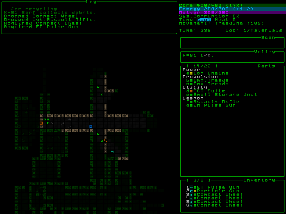
The subtle gradient was actually something I only did with the 6x6 font at first, specifically because given its size, the bottoms of lowercase g and y actually touch the tops of the uppercase letters (see the log window in the
example screenshot, where the g in "Dropped Lgt. Assault Rifle" is touching the C in "Acquired Compact Wheel"). I find those cases kind of unpleasant
without shading, and wanted more of a difference between the tops and bottoms of letters. On a whim, I decided to apply similar gradients to the rest of the sizes as well, and discovered I really love it! I'm still maintaining the unshaded versions too, though; not only will some people probably prefer them, the unshaded ones are also
much easier to make changes to...
It's funny, it seems we had the same idea for screenshots, but I didn't actually remember your UI preview was set up that way. I just wanted my screenshots page to be simple and organized, so I used html tables.
*shrugs*Oh, and as for your comment on my 6x6 tiles, I'd probably use the ASCII myself, as the letters look fine, but I think the graphical tiles are pretty ugly. Still, I impressed myself by making graphical tiles that are actually
readable in such a tiny size, lol. Just wanted to push that size boundary and see how small I could go. any smaller and the text itself just wouldn't be readable. There are already a couple of compromises in 6x6: I used some shading tricks with lowercase e (which has no 'hole' in it) and s (which is very muddy in the middle), but they're readable anyway. Just for kicks, I
did also made a 4x4
binary font, but didn't include it in this pack for obvious reasons (imagine trying to play
that)...